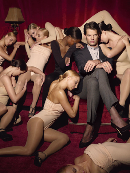
Hide Her Behind A Tree
Warning: If you have or have had eating disorders this post might be triggering.
I, or rather a forum of wedding photographers, have stumbled upon the gender find of the year. A masterpiece – in gender incompetence.
It’s a manual, with very specific, practical advice for how to re-create every thinkable gender stereotype when you take portraits. A Photographer’s Guide to gender discrimination.
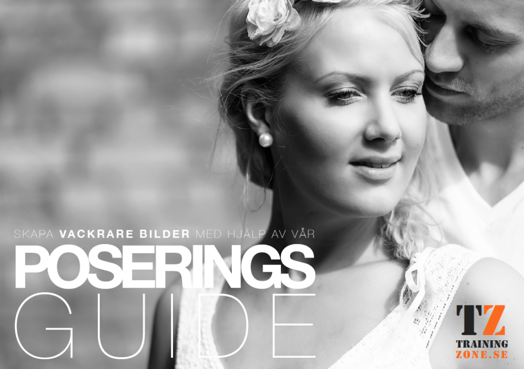
This is what it looks like:
It’s a posing guide, available free via Training Zone – “Sweden’s resource for wedding photographers”. It’s created by wedding and portrait photographer Benny Ottosson, who also holds workshops in the whole of Scandinavia. (I’m sorry Benny, but humanity will gain from this.)
The guide starts with what should be quite sufficient as far as gender fails go:
Separate categories for Posing Women and Posing Men. From here on out it can only come gender fails. It doesn’t matter which brush you use. Now you’re in the corner, shitpants.
But let’s hear. What poses are appropriate and inappropriate respectively for these two genders in particular?
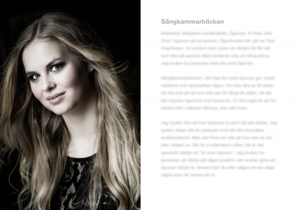
The chapter about Poses For Her consists of nine pages and is divided into headlines for each individual body part: the Head, the Face, the Bedchamber Gaze, Down With the Chin, Open Mouth, Smile or No Smile – That’s the Question, Shoulder and Chest Area, Arms, Hands, Waist and Abdomen, Legs, Hips and Feet.
The chapter about poses for Him is quite thinner. Only three pages.
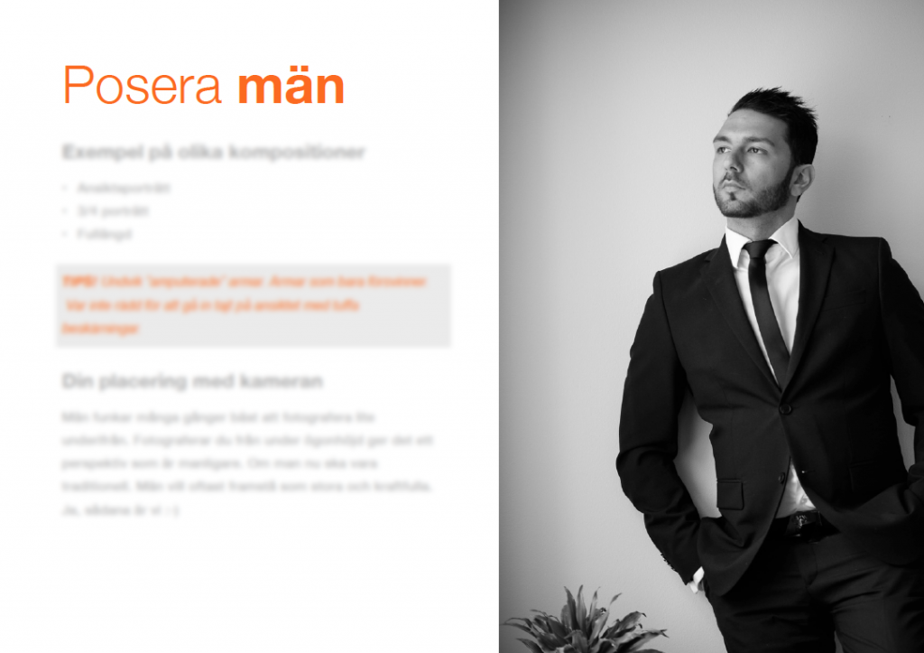
The headlines in this chapter reads Your Placement of the Camera, the Mans Body Parts, Lean Forward Always Works, His Arms, and Male Poses – Inspiration.
The arms are the only one of the man’s body parts that get their own headline, the rest is clumped together as the Mans Body Parts (to which I’ll get back to).
Shall we see if you notice the common thread in Benny’s recommendations for how to pose women?
Tips about the face:
A face looks wider if it’s directed straight forwards towards the camera. A good rule of thumb is to photograph it at an 45 degree angle.
Tips about the shoulders:
The shoulders should be turned obliquely towards the camera. If the woman is standing straight towards the camera she looks wider. That’s something she most often don’t want to. It also gives a more static and boring composition. On the other hand it can look nice on a thin woman. Experiment.
Tips about the hips:
Try to avoid turning the hips straight towards the camera. Then they look wider. So a little crooked and preferably with the light coming from the side.
Tips about the posture:
The body weight on the back leg. If she then leans lightly forward it means the body will automatically turn a little to the side, which gives a thinner impression.
Tips about the arms:
The arms should be held out from the body. Then you can see the waist and she looks thinner. If the arms just hang along the side of the body without that gap, the body looks compact and big.
Tips about the waist and belly:
It’s important as I’ve said before, to separate the waist and arms to look thinner. If the woman sits it’s very important that she archs her back to not collapse and risk that the belly looks bigger.
Tips about the legs:
If the woman isn’t wearing a long dress, and you photograph her in profile, it’s usually good to get a small gap between the legs, for the legs to look thinner.
Tips about leaning:
Often a standing pose works better. I usually ask the woman to arch her hip back and lean slightly forward. This because what’s closest to the camera appears largest.
Tips when walking:
When walking: walk slowly, looks more beautiful and you even look thinner, it’s easier to focus as well.
DO YOU GET IT YET?
Women should be thin.
Thinner.
Thinner.
You should do everything in power, use every mean – angle, light, center of gravity, gaps and bending – to get the absolutely thinnest possible out of the human you have in front of you. If it’s a woman.
In fact:
TIPS! If a body part can be bent. Bend it.
And as if the thin-mindedness doesn’t run like a theme throughout the whole posing guide, there’s this special chapter:
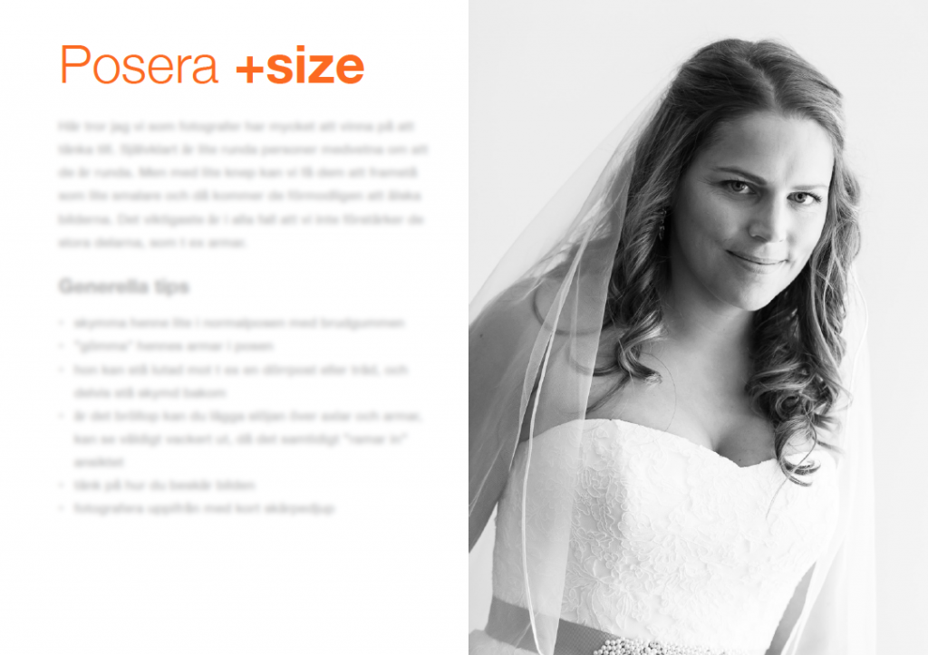
Here the level of gender incompetence reaches ironic heights.
Here I think us photographers have a lot to gain from thinking. Of course a little round people are aware that they’re round. But with a few tricks you can get them to appear thinner and then they will probably love the photos. The most important thing, in any case, is that we don’t pronounce the big parts, like for example arms.
The most important thing is that we pronounce damaging ideals. That’s what we earn most money on.
And here’s how you photograph a fat person without it becoming awkward:
- Hide her a little in the pose with the groom
- “Hide” her arms in the pose
- She can stand leaning towards for example a door post or tree, and partly stand hidden behind
Seriously?
Hide her behind a tree??
Are you fucking kidding me?

At the same time… This is so revealing. Because none of these tips are really – of course – about weight. But about gender.
And the puzzle piece (there’s only two) falls in place if we look at Benny’s tips for how to photograph men:
Men many times work best to photograph from below. If you photograph from below eye-level it gives a pespective that’s more manly. If one is to be traditional. Men usually wants to appear big and powerful. Yes, such are we. :-)
Hehe. :-)
Men should be big. Want to get bigger. Take up more space. As soon as boys approach puberty, they should get bigger, build muscle. Girls should get smaller, starve, take up less space physically and make body language smaller and shrinking and soft; feminine. Women should take less mental space by restricting the brain’s energy supply (calories) and by putting all the focus on controlling and observing their body, “fixing” everything that is “wrong” – and which this guide to wedding photographers does an excellent job of pointing out.
But making yourself small, thin and totally non-space grabbing isn’t the only criterion you must meet to be a viable woman, right? (Otherwise we would simply have been able to place all women behind trees?)
No, you should also please.
I often think it gives a softer, more romantic impression with the mouth open.
Or rather, it’s perhaps most important to not displease.
Usually it’s better to photograph a woman slightly from abbove. Over eye-level. It gives a softer and more feminine perspective. And it makes the women get better facial features and you avoid for example double chins.
Yeah yeah, enough with the double chins now.
The chin should not be too high, then she can look haughty. If her chin is too low, there is a risk of a double chin.
OKEY, FUCK the double chins and say what you really want to say.
It’s also important to encourage a nervous woman who’s not used to standing in front of the camera. Tell her she is very good and beautiful (which she is, of course). It can also make her shine up.
It’s not only a criterion to please – to be beautiful, part the lips, not look to big, hard or proud, preferably not have any arms – that’s a condition. Of cooooouuurse you are very good and beautiful for me. Otherwise you… aren’t a woman?
Standing a little crooked towards the camera also emphasizes the feminine forms in a nice way.
Tell me, Benny. If the “feminine forms” are so womanly in themselves. Why do we need 38 different adjustments to make the woman look right?
Boom.
The Man’s Body Parts
Yes, we will not go through all of them :-) Many of the things you should have in mind for not making a woman look bigger, the opposite applies to men.
Yeah. It’s that simple. Manly = not womanly. Womanly = not manly.
This is how gender is constructed. We must see the difference between women and men, we think. And we create that difference, to a large extent, in pictures. Images have the magical quality that through prolonged, constant repetition, they can get certain ideas – for example, stereotypical notions of how women and men are or how they should be to be attractive, normal and comprehensible women and men – to be cemented and felt “natural”. All pictures are really posing guides. Or to quote Judith Butler: “gender is a kind of imitation for which there is no original“.
Usually the posing guides around us aren’t provided with extremely revealing, detailed text about exactly how that construction happens.
For that, Benny, I thank you. This will come in handy.
And to be fair: You are not the only one who follows a bunch of old rules for which origin you cannot place.
Avoid making your arms look “amputated”. “Avoid cutting at the joints” there was an old rule that said.
Finally, some advice for how to pose opposite sex couples and make them look natural and relaxed:
The Kissing Game (stand opposite each other, they can’t move their legs, he should try to kiss her and she should try to avoid it)
A little rape culture on top of everything, also. Romantic.
One last tips from me and Benny in dialogue:
OK, you have placed the woman, but where should you and the camera be?
Somewhere else.
This post was originally posted 20 October 2014, in Swedish. The covered free posing guide for wedding photographers has since been discontinued.
Who becomes Sexist of the Year 2013?
In 2013, sexism was news.
We saw the pattern repeated over and over again: A clothing company, a white well-off male restaurant keeper or a Danish monster chooses to market themselves with the help of coarse sexism.
The images cause a blast in social media. Old media describes the shit storm. Then, in several interviews, the company, the pub or the monster may explain to us that sexism is Art, and that we who are offended by it are unsophisticated, hypersensitive and uncool censors.
We will dissect this phenomenon closer. I will take you on a tour through the bloodstream of sexism and together we will study, punctuate and review six works of “art”, in order to crown …
Sexist of the Year 2013
Five of the candidates have already gone through the cycle I described above. The sixth has all the potential in the world to do so. (It is the worst of all over a thousand images I received in 2013 – it is a mystery how not more people have seen it and panic, where it is fully visible for anyone to see and has done so at least since the beginning of June.)
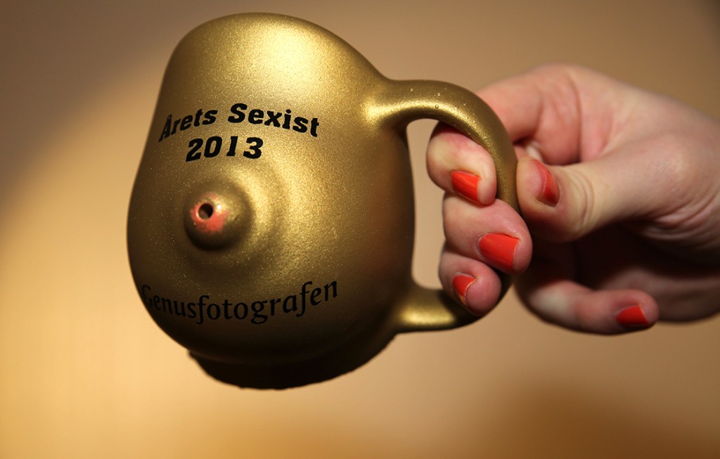
The winner will receive a small prize I did during my Christmas holidays.
I will personally hand out the Golden Boob Mug.
But only if I have got over 1000 votes! (Otherwise I’ll sell it in a street corner.)
You can vote until 8pm on Friday. And you do this by ticking your favorite sexist in the voting form at the bottom of the post. Please also contribute your motivation in the comment section.
Which picture do you think carries the most harmful gender baggage? Which image gave you the most stomach ache because of the most connecting points with real discrimination?
And the nominees are…
Per Lydmar
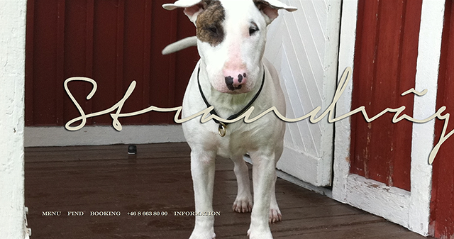
for the woman on Strandvägen 1
Without calories, you won’t have the energy to stand on the barricades.
That’s the spirit of Naomi Wolf’s feminist 90s bestseller The Beauty Myth: How Images of Beauty Are Used Against Women. At a time when women seem to have more power, career paths and human rights than ever before, the last path of patriarchy to social control is through their stomachs. Create a beauty ideal that causes her to reduce herself, her psyche, her existence. Have her direct all the will to change to her own healthy body instead of our sick world.
From that perspective, the background image that the pub owner Per Lydmar chose for the website for his new luxury pub is patriarchy-smart. A woman with a veil in her face. A breast that refuses to stay within the dress. Ribs pressing against the skin and rocks pressing against her buttocks. And no food as far as the eye can see.
As a woman you should not be hungry. Neither on sex, food, or knowledge, nor in other ways to live and expand in the world. You need to be there to feed an appetite – not have your own.
The ideal woman is neither sitting at the dinner table nor standing on the barricades. She sits on the rocks in the archipelago and sips the saltwater-wind filtered through a veil (and vomits it in the foam of the waves when you look away).
Per Lydmar’s defense:
“I have been interested in art and exhibited it in public settings since the mid-1990s. Much has been far worse pictures than this.
… If anyone thinks I have this picture to sell more potatoes, I don’t think you know me that well. I’ve had Ku Klux Klan pictures in my old lobby.”
Really?
You don’t think there would be any reactions at all if your website looked like this?
After first saying “I have never censored our art and will not do it now either” Lydmar then did exactly that and replaced the woman on Strandvägen 1 with a photo of his innocent bull terrier Billy:
Well. But what went wrong then? Why didn’t people think this image would represent art?
Gender Coach Tips: Do not use a model with the body type that appears in 95 percent of all commercial images but only 5 percent of real women have. It gets people to associate with commodification of women’s bodies and the vampiric-bulimic fashion industry rather than art.
In the article Fashion Models as Ideal Embodiments of Normative Identity , sociologist Patrícia Soley-Beltran describes how the Model, through constant repetition in the visual world, was incorporated as a symbol filled with messages (among other things about gender, ethnicity, sexuality, glamor and consumption), rather than actually meaning “a human being”.
The model is the norm in the pictures that surround us. And the effect of embodying a norm is that one becomes invisible. We rarely think about how bizarrely photo models really pose until they end up in a context where they stand out. (Like on a website where you expect to see a picture of a sweet, butter-drooling potato, but are met with a picture of Death by the sea.)
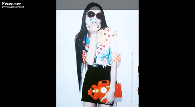
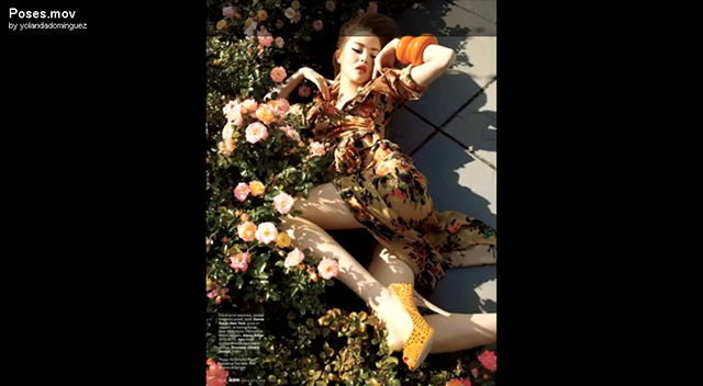
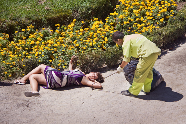
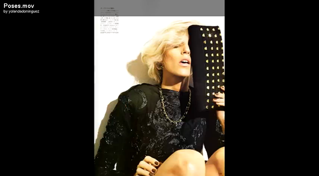
A good example of this is the Spanish artist Yolanda Dominguez’s project Poses
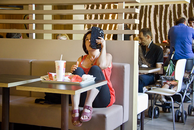
Photos: Yolanda Dominguez. Google Yolanda Dominguez art project to see it in its proper moving format.
A man had probably looked very weird on the rocks in the Strandvägen 1 picture. But my point is that it would be enough to put a woman with any kind of body other than the standard white, lean, upper-class, feminine, 180 cm tall and 18 years young body with no visible disabilities to make the image look completely absurd.
And then it probably felt more like art than it did now.
Could perhaps the Golden Boob Mug could be a nice new background image for Per Lydmar’s website?
TT News Agency
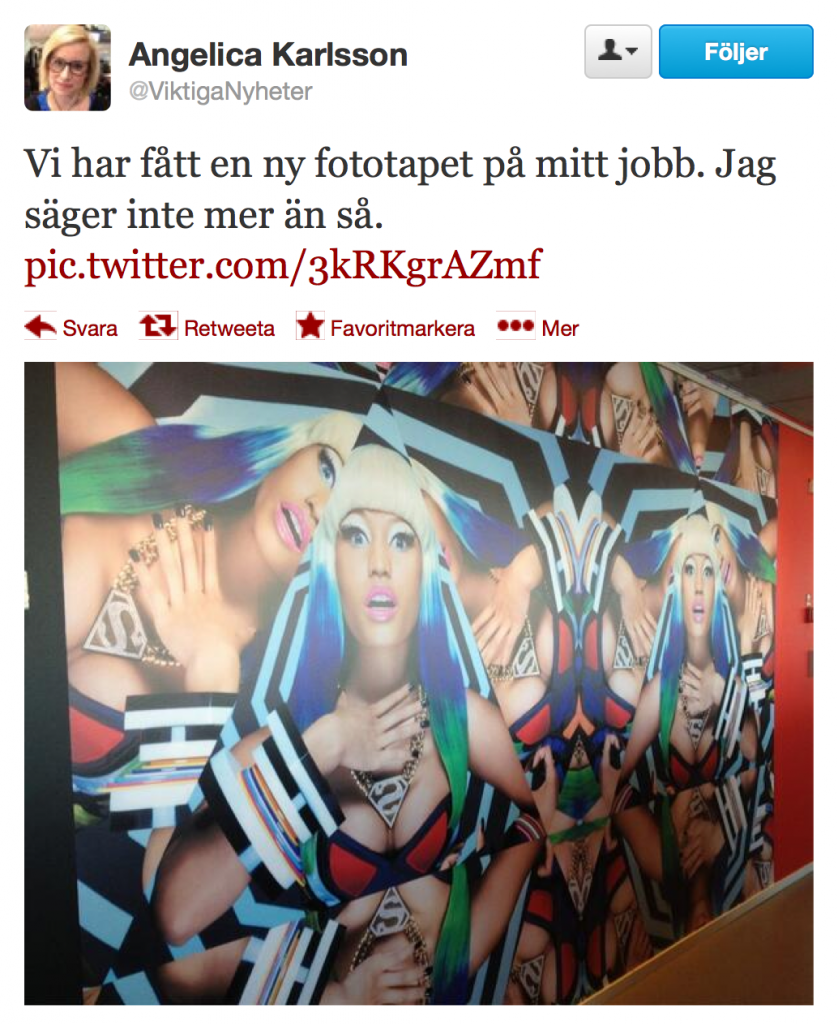
for The Breast Wall
When I first heard that there would be a new “breast wall” at Sweden’s largest news agency TT, I imagined something like this:
The actual breast wall, however, turned out not to be quite as easily condemned as the one above had been.
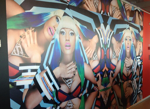
A collage depicting six of pop star Nicki Minaj’s faces and 15 pairs of her breasts.
The breast wall split our social media swarm brain in half. Some just perceived Nicki Minaj in a bikini bra or were even provoked by the mere thought that Nicki Minaj would even be reduced to a sex object. Others looked hypnotized at the wall, studied details such as Nicki Minaj’s head sometimes disappearing into the pattern but never the breasts, and could not discern a human subject in the photo.
TT’s CEO Jonas Eriksson chose this attitude:
“Pictures affect us in different ways. We also have pictures of a house that has been torn apart by bombs, but it is part of our everyday life. We can’t remove a picture just because one or two employees get upset and think it’s horrible.”
Houses bombed to shreds. Ku Klux Klan…. Interesting how the men who defend these images nonetheless associate them with other human rights violations.
But okay. What does the Gender Photographer think then?
Well, the first thing I noticed when I saw the picture was not the breasts.
Nervous breakdown, would maybe be the title I’d give this image. Or Nicki Minaj assaulted by a drunk giant spider depicted from the spider’s view.
I can agree with those who found Minaj looking pretty shattered. Both by the pattern and psychologically. The hand on the throat as if she was suffocating. The terrified look. A classic, glamorous “scared but horny”–pose, but unusually little horny in it. It’s an unusual Nicki Minaj in the picture over all, I think. The artist that TT specially commissioned this collage could easily have found many pictures where her personality shines through much more strongly.
I’m not saying this picture would do better as a photo wallpaper in a workplace, but surely it shows more who she is as a person even when she makes the stricken porn-influenced “sex doll”-pose?
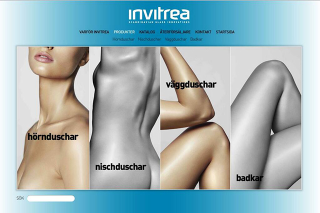
Then I must also agree with those who have criticized this wall that yes, getting your body fragmented, cropped and chopped up into decoupled sexualized body parts instead of being depicted as an intact, composed human is something that more often affects women than men in the pictures.
In the article Significant Bits and Pieces:Learning from Fashion Magazines about Violence against Women (pdf), law professor Cheryl B. Preston describes this as one of several examples of how women are subjected to “photographic violence” by getting their humanity trivialized in the picture:
“A surprising number of women in ads are cropped somewhere across the face. … Countless ads omit women’s eyes and other signals about their person.
The breasts are often in focus, but even when sexual parts are not emphasized, interchangeable legs, partial backs and other body parts are scattered among several frames in a way that the woman is denied bodily integrity.”
Cheryl B. Preston
Two examples of it, and of how unnoticed it passes.
From the website to a small shower manufacturer in Skogås, Stockholm:
Where are the men? (And the showers?)
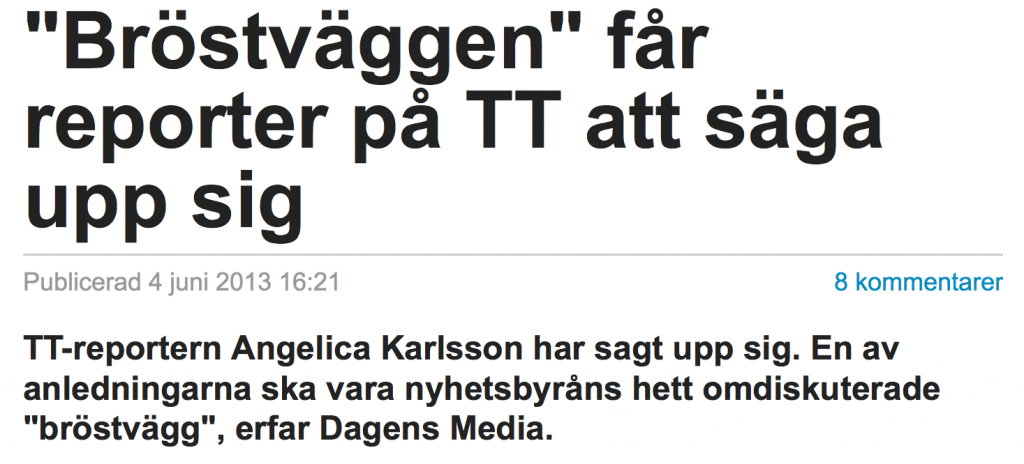
So … I can see several reasons why someone would feel bad about this picture, in addition to Nicki Minaj’s breasts being over-represented in relation to her face. But what does it matter what I think? Several of the employees at TT strongly disliked the wallpaper. And the managers at TT chose not to listen. It cost them a reporter.
Angelica Karlsson is working now for Aftonbladet instead.
A Golden Boob Mug to the managers of TT, whom can take turns having it on their desks, as a reminder that it can sometimes be good to swallow your pride and paint over a damn wallpaper?
Anders Vendel
for Wendel’s dining room
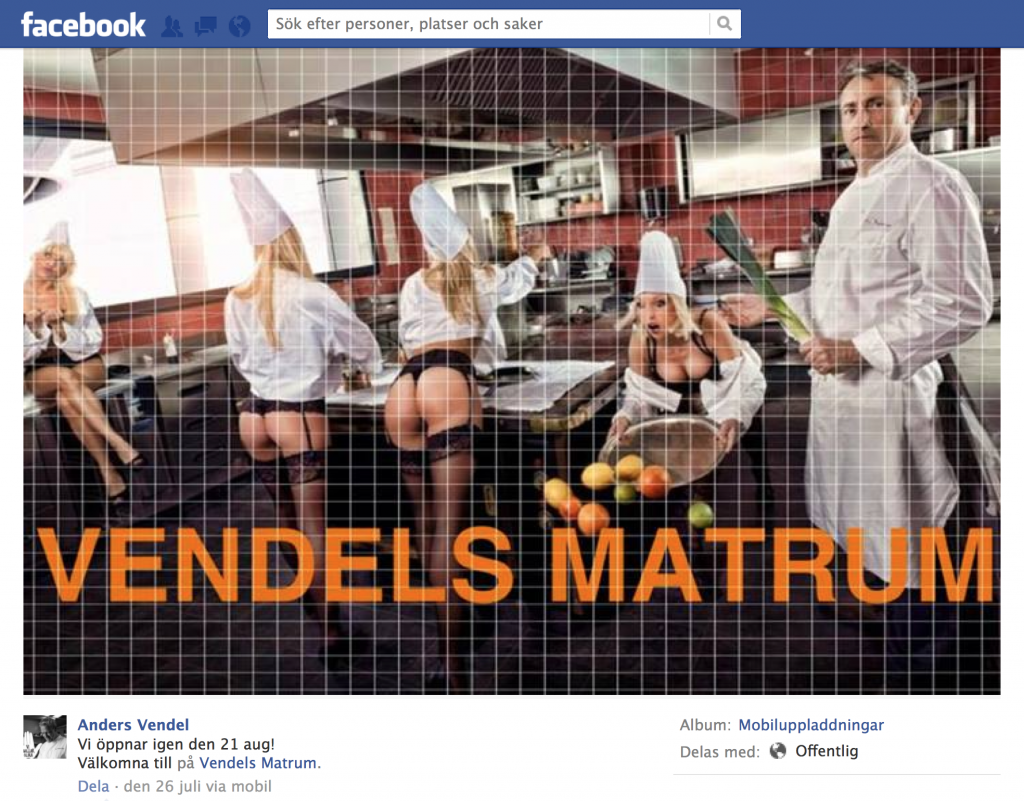
Four women and a man in a restaurant kitchen. The women wear chef jackets and cap hats, string panties, hip holders and nylon stockings. One of them files the nails, another stumbles and drops a bowl of fruits and almost their breasts. Monitoring them is a male chef holding a leek like a whip.
Message: Women are not only unintelligent life-forms, they also spread e-coli bacteria in our restaurant kitchens.
When criticized, TV chef Anders Vendel commented the photo, which was used to announce that his restaurant will open again in August, like this:
“You could say it’s modern art. A little unexpected, as the food may be. So I think there’s a theme here.”
To say the least.
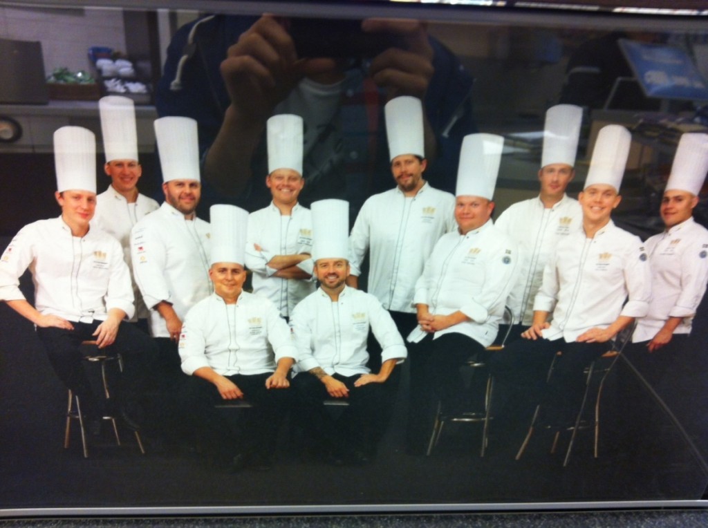
What’s the thing with white rich male chefs and sexism? I mean, it is obvious that Anders Vendel saw the media revolt around Strandvägen 1 and decided that he also wanted to put his restaurant on the sexist restaurant map. But can there be any particular reason why chefs are serving us the crudest sexism?
I think it may be because the gender equality in the restaurant and restaurant industry is to hell.
If you count the total number of chefs in the country (all kinds of positions: chef, kitchen chief, catering chef), 53 percent are women and 47 percent are men. But at the elite level it is almost next to just men behind the aprons. One woman ever has won the Chef of the Year competition (Kristina Petterson, 1988). Among the top-ranked restaurants in White Guide – which rank Sweden’s finest restaurants – three have female head chefs.
And how many female chefs do you guess that the Swedish chefs national team 2013 consisted of?
None.
And what tends to happen in enclosed rooms where there are almost only men and dickheadedness atmosphere can ferment and ferment?
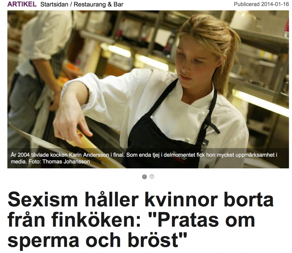
If you read the article above from Everything About Stockholm, you get a clue that Anders Vendel may not be a lone ass, but that it his “art” could rather represent a crude sexist culture in kitchens.
“It’s sexist – oh, yes. I have thousands of examples of this very sexist jargon. I have heard it is discussed everything from sperm consistency to those in the service who have the nicest breasts. It’s something you are forced to hear every day. If you complain, you’re a prude.”
Female chef, 28 years
“Even if you have a collegial relationship, you do not want to be in trouble at work. Or to be patted on the ass and treated with the ‘little girl’-attitude. And in the event of a conflict, you are at a disadvantage because it has been cemented that you are at a disadvantage. ”
Female chef, 36 years
Territory-markingPISS from men who hasn’t had their dominance challenged before? (Note that the women in Vendel’s ad actually are supposed to represent chefs.)
But he doesn’t just piss on his female chef colleagues. The urine also sprays down on other women in the restaurant industry, who have lower and less stable positions.
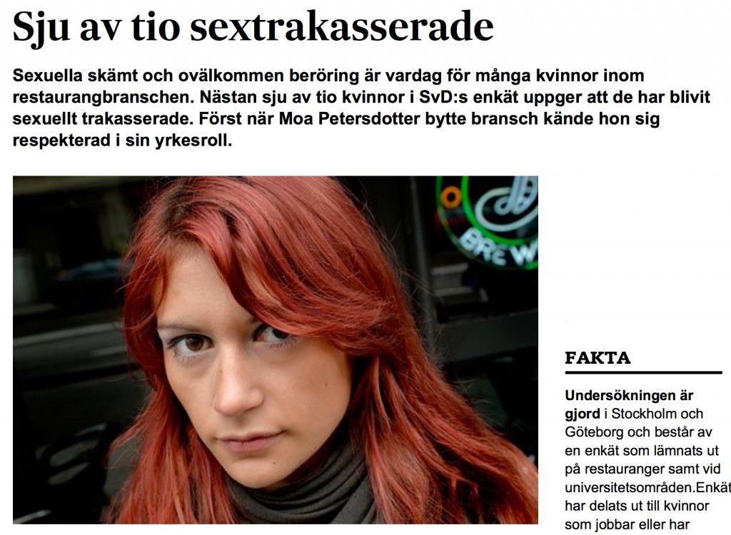
SEVEN out of ten – 66 percent – of 300 women in Stockholm and Gothenburg who work or have worked in the restaurant industry, answered “yes” to the question in the SvD’s questionnaire if someone had behaved uncomfortably in a sexual way against them, if they’d experienced unwelcome touch or abuse during working hours.
“As a waitress, you are a public property that everyone wants to have a piece of. … Flirting is perfectly normal, it’s everyday. “Innocent” touch is also perfectly normal. “
Jeanette Superti , 33
“As the headwaiter passed me, he grabbed my hips and pressed my butt towards his genitals. He could also drop comments like ‘How good are you sucking’ when I vacuumed the restaurant.”
Katarina Anderson, 20
“Flirting unashamedly, being close and having a vulgar jargon has always existed in the restaurant world. … the chefs who can’t stand it usually move on to another industry. “
Waitress, 27
In how many industries have the majority of all women been involved in sexual harassment?
Understand that Anders Vendel is an employer.
Could their be any more tasteless sexists?
Hey, we’re only half-way through the gallery.
Thomas Blachman
for Blachman
Denmark, 2013:
Sorry. Wrong picture.
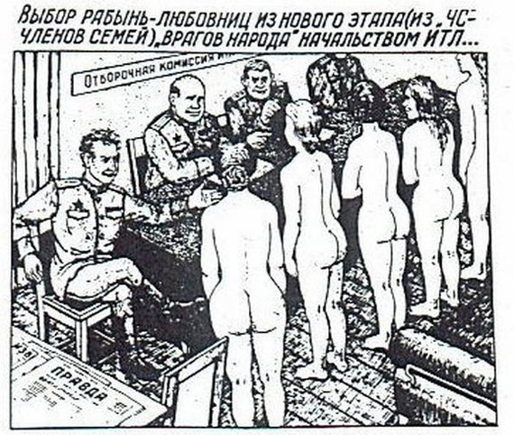
This certainly represents how the leadership of a Soviet concentration camp selects sex slaves from arrested family members of “enemies of the people”.
Here we have the right picture:
Here in Sweden we have just raged against Belinda Olsson’s SVT broadcast where she explored today’s feminism on the basis of classic anti-feminist issues like Has feminism gone too far? and Has feminism subdued men?
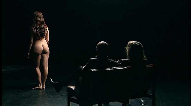
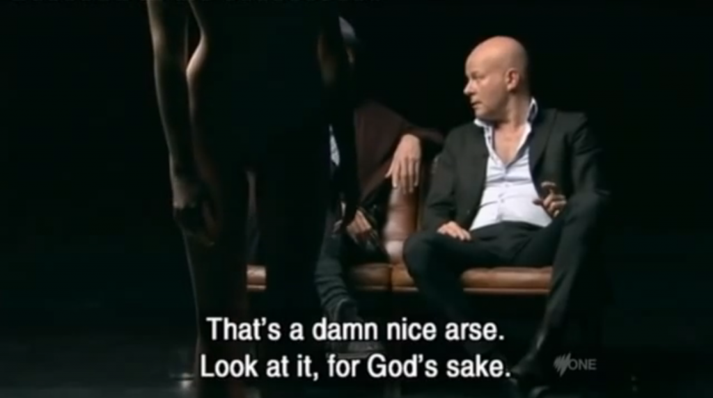
But have you forgotten what happened in Danish public service television less than a year ago? A man with exactly the same concern (over the success of feminism) was allowed to do a program where he, along with other costume-clad men, sat in a black, claustrophobic, strip-club-like studio and discussed a procession of naked, silent women’s bodies.
“We are on our way to a cockless society,” said the show’s main character, the jazz musician and talent show judge Thomas Blachman – gesturing castration-anxiously towards one of the women. “We have a visionless society because the men have become more female than the women themselves.”
But instead of doing a program where he and other cultural figures sit and try to piece together a naked man’s endangered body – because it’s the masculinity that is said to be in state of dissolution – he did a program where he and his buddies sat and said things like:
How logical did it feel, really?
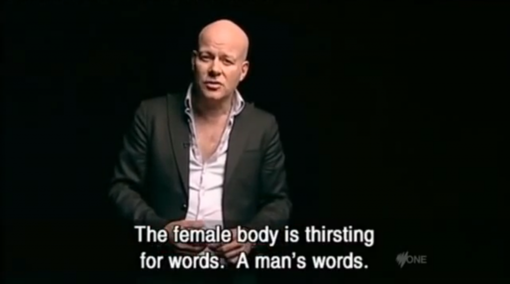
Well, Blachman himself motivated both the design and eligibility of the program with these introductory words:
“The woman’s body is thirsty for words. A man’s words.”
First of all, NO. I’m pretty sure that the woman’s body isn’t thirsting for more constant judgement by men, but rather to be free of men claiming their right to women’s bodies – physically or verbally.
Second: FAIL. Because that’s not what Blachman managed to illustrate. What he rather managed to illustrate is how the male ego thirsts for an order in which the woman is a passive object whose primary task is to please, confirm and accentuate the man.
To quote the genius Virginia Woolf, from her essay collection A Room of One’s Own (1929):
“Throughout the centuries, women have served as mirrors with the enchanting and delightful ability to reproduce the man’s image in twice the natural size. … That is why both Napoleon and Mussolini so emphatically emphasize the inferiority of women, because if they were not inferior, they would cease to enlarge.”
Virginia Woolf
And to illustrate her point with one of the thousands of pathetically obvious examples of how women have been reduced to male-magnifying mirrors in art history:
Have the feminist nymphs gone too far? Have the feminist nymphs subdued the faun?
We reacted very strongly to Blachman. And by us I mean both Sweden and Denmark. (The picture that Denmark should have taken Blachman with a free-spirited shrug is false.) But we did respond particularly strongly here in Sweden. And I have a theory as to why.
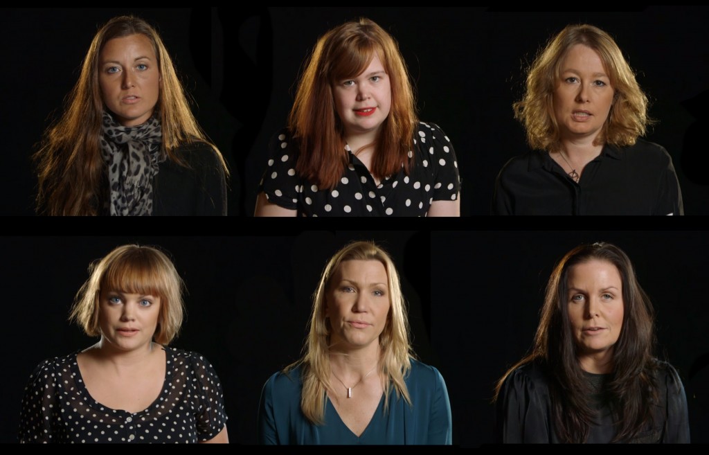
Where had we recently seen a black studio on television? The dark background vacuum, the strong, yellow interrogation lamp and a succession of women who took their place in it. The sound of men’s words, directed at their bodies. Read by themselves.
“One day I will personally cut your throat and leave you with the knife driven up into your pussy.”
Maria Sveland, author
“I hope you’re down there because I want to come and fuck you hard in both your big ass and your creased pussy.”
Åsa Linderborg, head of culture Aftonbladet
“This is the time we should meet and have sex. I’ll be waiting for you outside the TV house. If you say no then the butchering awaits. I’ll hang up all the body parts in the meat hooks. After that, I will fry your breasts with butter. Mmm, that’ll be good. “
Jenny Alversjö, Newsreader in TV4
The woman’s body is thirsty for words. A man’s words.
In the program Uppdrag Granskning’s episode Men Who Hate Women (broadcast on February 6, 2013), we got to see how threatened, naked and worthless some men feel about seeing women take a seat in public. Two months later (on April 2), Danish TV responded with a stage set like the society these rape-threatening and death-threatening men have visions of.
A society where women shut up and are beautiful. A world where women’s freedom of movement is limited to a pedestal. Without prospects. Only darkness and the man’s voice. (“Your body is your world, and I describe it. Take it easy, as long as you measure up in my eyes you will not fall.”)
Thomas Blachman is worried that men have become women. Solution: To show everyone who really is the woman. To imprint into our retinas so that we don’t forget – who is cockless and therefore should remain powerless. (“How’s that pussy working for you?”, Blachman says to a naked woman in the first episode of Blachman.) His hidden ideological agenda is exactly the same as patriarchy has practiced throughout art history: Visually merging the biological women’s body with the feminizing situation to be viewed and judged – a silenced object.
And in the same way, the men who write e-mails with gendered words full of knives to public women hope that the underlining attack on their gender will carve a reminder into their heads that their bodies mean subordination.
Two different types of demonstrations of power – a visual and a verbal assault – which are basically about the same thing. Bludgeoning women into men’s magnifying mirrors.

Do you think this man seems to need a comforting Golden Boob Mug to suckle? If so: Vote Blachman.
American Apparel
for The Unisex Shirt
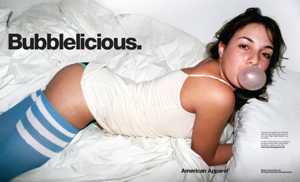
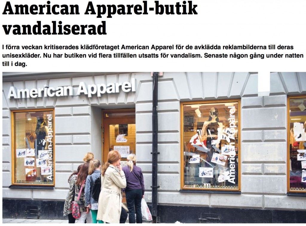
No sexist list of the year would be complete without American Apparel. One of the most sexist companies in the world, but which we – despite having had stores in Sweden since 2007 – haven’t really had a healthy, massive allergic reaction to until now.
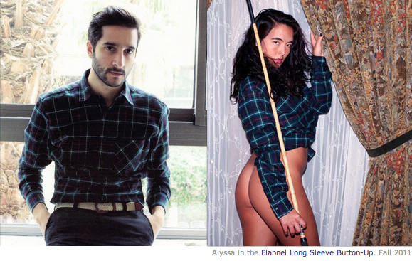
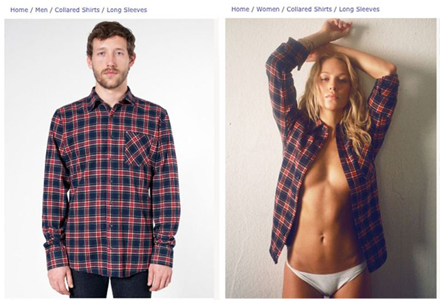
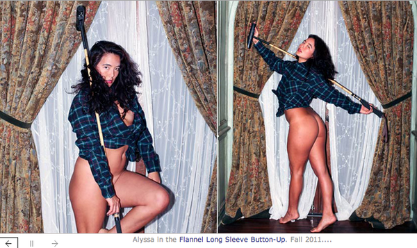
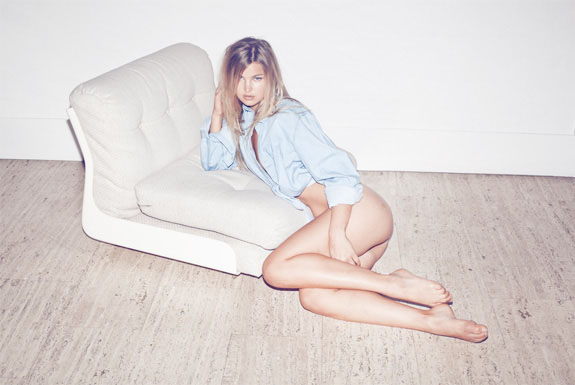
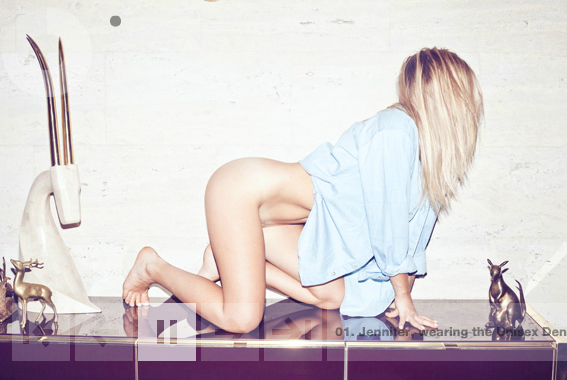
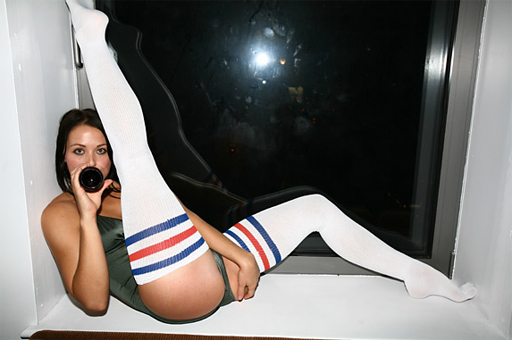
Of course, I’m talking about the Unisex shirt. The allegedly gender-neutral flannel garment that turns men into kittens who’ve happened to drink a capsule of horse anesthesia and caused women to lose every piece of clothing except for the shirt and swing horse polo clubs in abandoned apartments.
Feminist retro fashion blogger Emelie Eriksson should definitely have a prize for Gender find of the Year. Her desperate search for images of the unisex shirt on a female body where the woman actually wears pants to the shirt was as entertaining as it was educational.
And the shirt itself is the perfect neutral measuring stick to show how asymmetrically the sexualizing gaze hits men and women in commercial images.
But American Apparel is, as I said, an extreme.
Har du reflekterat vilket utskott av icke-visuellt kvinnoförtryck som unisexbilderna påminner om och kanske medvetet anspelar på?
Have you reflected on which outgrowth of non-visual oppression of women the unisex images are reminiscent of?
Neither had I, until I stood and gave a lecture to the Stockholm Prostitution Unit – an organization that supports people who’ve sold sex, hurt themselves with sex or suffered trafficking – and the pictures above were next in my slideshow.
She’s in an empty, unfurnished apartment or villa with nice curtains (probably not hers). She’s playing with a horse polo club (upper class sport; probably not hers). The consciously amateur aesthetic – no lighting equipment, just a flash straight on – to enhance the sense of realism; the feeling that she’s really yours.
Now that I think about it. Does it even look like it’s her shirt?
You’re a sex buyer.
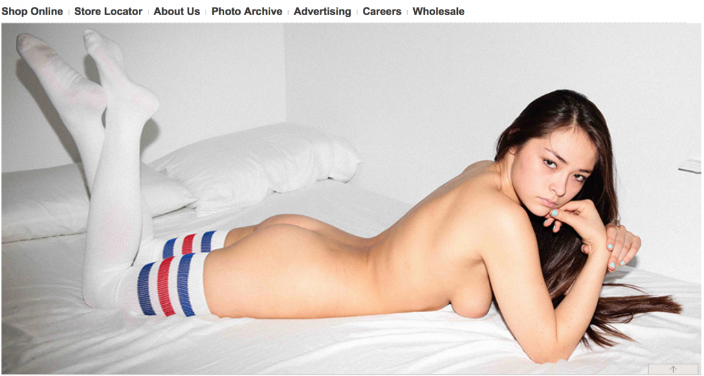
Whose look would this picture otherwise belong to if we translated it straight to a real scenario? Not only does the room lack furnishings that indicate that it is for living, it also lacks warmth and closeness. It doesn’t feel like a picture you would take if you were her horny, dear girlfriend (or boyfriend). And it doesn’t look like amateur porn. Because even though American Apparel does what many porn sites do – to simply portray their models stripping across multiple frames – it never happens that elastic bands crosses labia and a cock slips into the image.
The pictures do not contain sex, but promise of sex. A promise that she can be taken by you in as ritual forms as the pictures are taken.
An extreme example, as I said. For a clothing store’s product images. But not for American Apparel. The entire visual style of the clothing brand can be summarized as “sex with minors”.
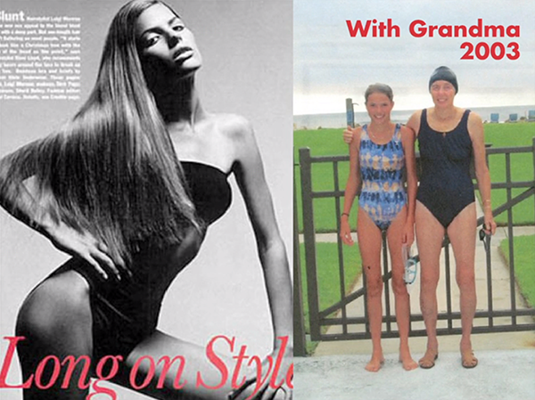
They do exactly the opposite of what most other fashion companies do. Instead of using ideally chiseled models, poses, art direction and retouching to hide the girls’ young age …
Photos of the model Cameron Russel taken the same year.
In none of the pictures she’d had her first period.
… American Apparel does everything to emphasize the youth of the models.
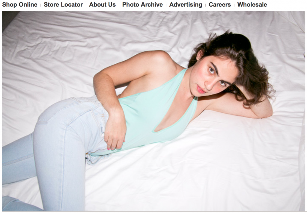
Wait, are all of them photographed in the same bed, by the way?
(No, perhaps not. But virginal white beds throughout.
But it gets even worse.
As if these models aren’t already very young, American Apparel often let them to pose with the body-language of infantile, unaware toddlers drinking from bottles and kicking with the legs, or blowing bubbles in beds – while being sexualized.
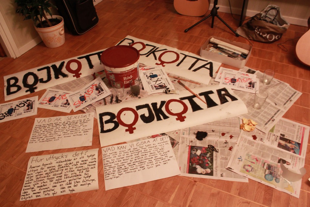
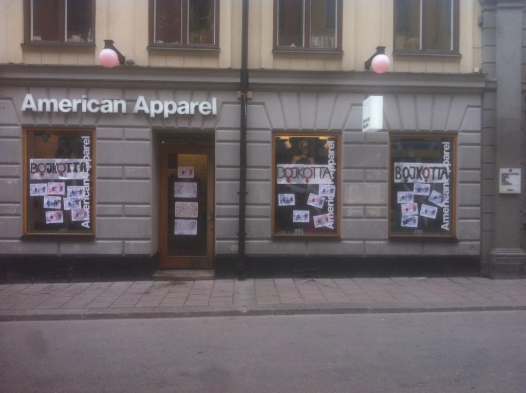
Vandalism or self-defence?
A peacefully delivered Golden Boob Mug to American Apparel headquarters by the Gender Photographer? Or perhaps a golden pacifier would be more fitting?
Okay. Then there was one a candidate left. And this is the picture that haven’t caused a shit storm. (Yet.)
It’s the image that stands out most in the accumulated compost of sexist images that have reached me by Twitter, e-mail or hearsay in 2013. And I still can’t understand how or why it came to existence …
WARNING FOR SENSITIVE IMAGE
*
*
*
Salong Bangs
for this:

And I still have a hard time finding words … So I borrow a couple from the feminist rapper Cleo’s song Go To Salon:
I make myself fine at the salon
I pick my eyebrowns at the salon
Do manicure at the salon
Fix my hair at the salon
Get strangled at the salon???
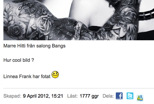
I really wonder what the message of this picture is. “Do you feel that you are not good enough as you are? Go to a woman abuser – they are best at telling you exactly how you should be”?
And who is the woman in the picture suppose to represent? You, the customer?
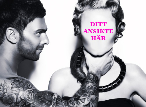
Your face here. (Note: Gender Photographer’s remix.) Photo: Linnea Frank
Or are they supposed to be colleagues? Is he a stylist and she a model and are they in the middle of a photo shoot? Is it art? Edgy artistic fashion photo? Or a provocation? In that case it’s quite unsuccessful, because this is the only internet-registered reaction to the image I found:
As you can see, the picture has been out since at least April 9, 2012.
And no one in Marwan Hitti’s presence seems to be bothered by him having the picture as a profile pic on Twitter either.
In that case it’s an even greater reason for concern. Because that’s the effect of images that glamourize, aesthetisize and sanitize violence against women. Normalization.
Who was Sexist of the Year 2013?
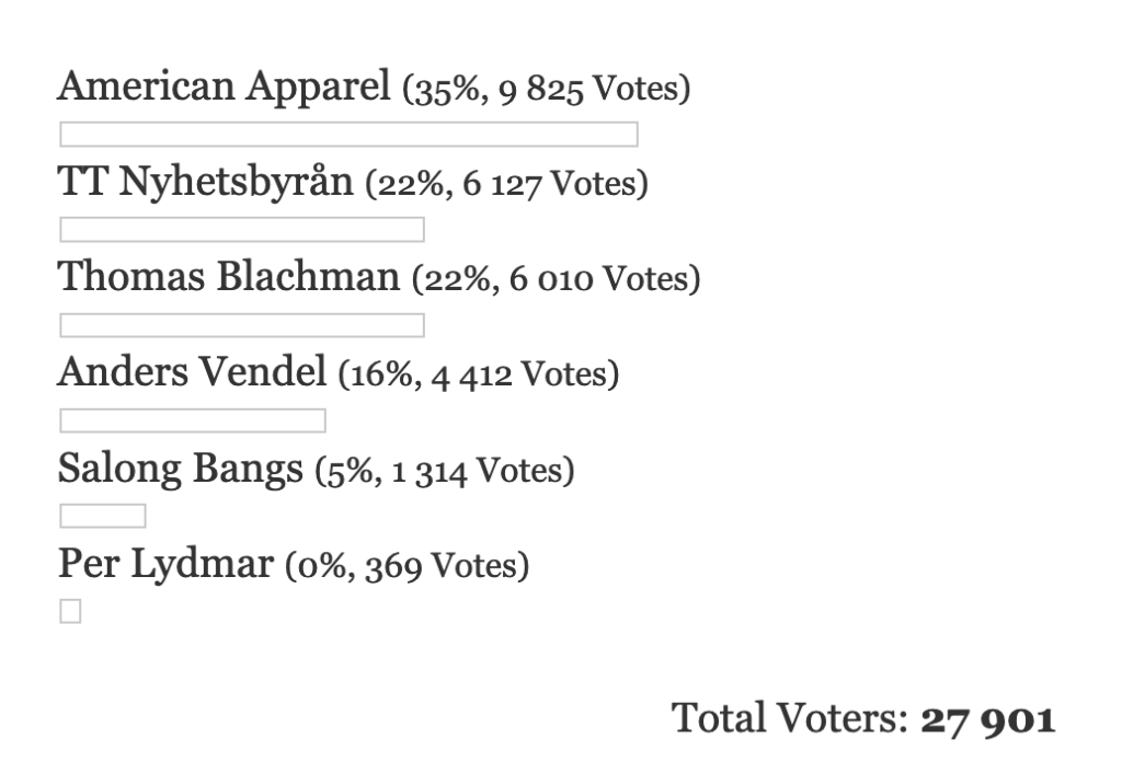
The poll was closed the night of February 7th.
Forty Shades of Power Balance
Another quarter has passed. And it is time for forty new pictures – hand-picked by you, sent to me via Twitter, mobile, mail and mouth – to lie down on my long, sloping gender therapy couch. This is…
Tips I’ve gotten between 1 January and 31 March 2013
The first category maybe you didn’t think would get re-filled that much in 2013, since it’s pretty well-established as GENDER FAIL No. 1…
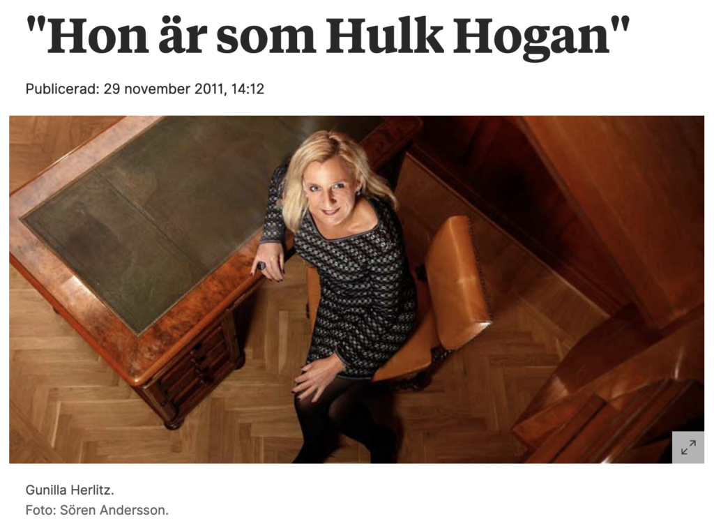
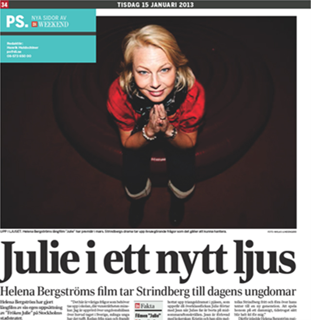
Photographing away women’s power by depicting them from above; a camera-angle that gives the one seeing symbolical power over the one that is shown
40
Gunilla Herlitz. Editor-in-chief and CEO for the Swedish morning newspaper Dagens Nyheter 2009–2013. Photographed for the trade magazine Resumé in a way that makes her look two… three apples high?
39
Helena Bergström. Actor and director that’s been in Swedish movie business so long that she has probably generated an aura of authority that would make you knee-weak. Here depicted so that she looks like a tiny, cute, unproblematic gnome. (That’s sitting on the toilet?)
38
Katrin Stjernfeldt Jammeh, Malmös new muncipal council chairman, that’s TAKING OVER MALMÖ, the image wants to illustrate. But ambushing her, apparently, was an even bigger giant with a camera.
37
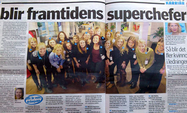
These twenty civil engineer students – who’s competing for a Future female leader award – the magazine Ny Teknik is betting will be the super-bosses of the future (according to the headline).
In words. In imagery: The springboards of the future.
36
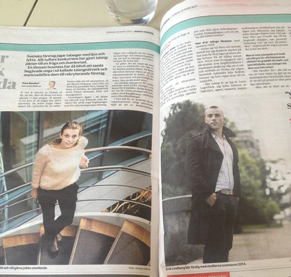
More future talent, interviewed in Dagens Nyheter about a talent network that markets young talents to recruiting companies.
What would the recruiter like? A view, or someone with a vision?
35
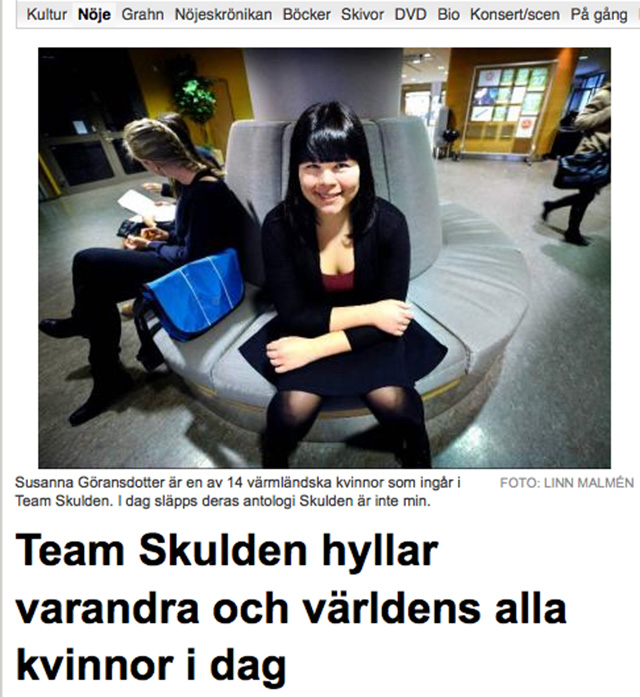
Susanna Göransdotter, one of the persons behind the feminist blog The guilt is not mine which is about feminists not having the constantly resume a defensive pose for their views. Interviewed for Värmlands Folkblad on the International Women’s Day.
Photographed in a defensive pose. Like the guilt was hers.
34
Two slimey men and Sweden’s most dangerous woman (according to the internet forum and psychiatric clicic Flashback).
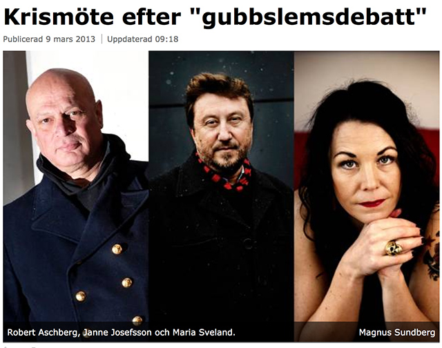
Maria Sveland has written the book (Hatet) about men who get reversed delusions of grandeur and send death threats, gang rape threats and vagina destruction poetry to women who doesn’t keep a pleasant distance from the public discourse, asks for forgiveness and shuts up.
In this photo in Göteborgs-Posten it looks like Maria Sveland prooooomises to be quiet and cute and nice-submissive, if she only gets another chance! Or a forgiveness for her since from the old gents next to her, who are each not only glorified with a from below-perspective – a camera-angle that ascribes the one depicted with a higher degree of authority – but also actually positioned above Maria Sveland layout-wise. (The guilt in this case is entirely the editor’s, since the photos surely wasn’t taken exclusively for this article.)
Which leads us to next category…
Women who for some reason has ended up under, behind or in the beards of men, or who have in another creative way been made invisible or their competence made invisible by/with men
33
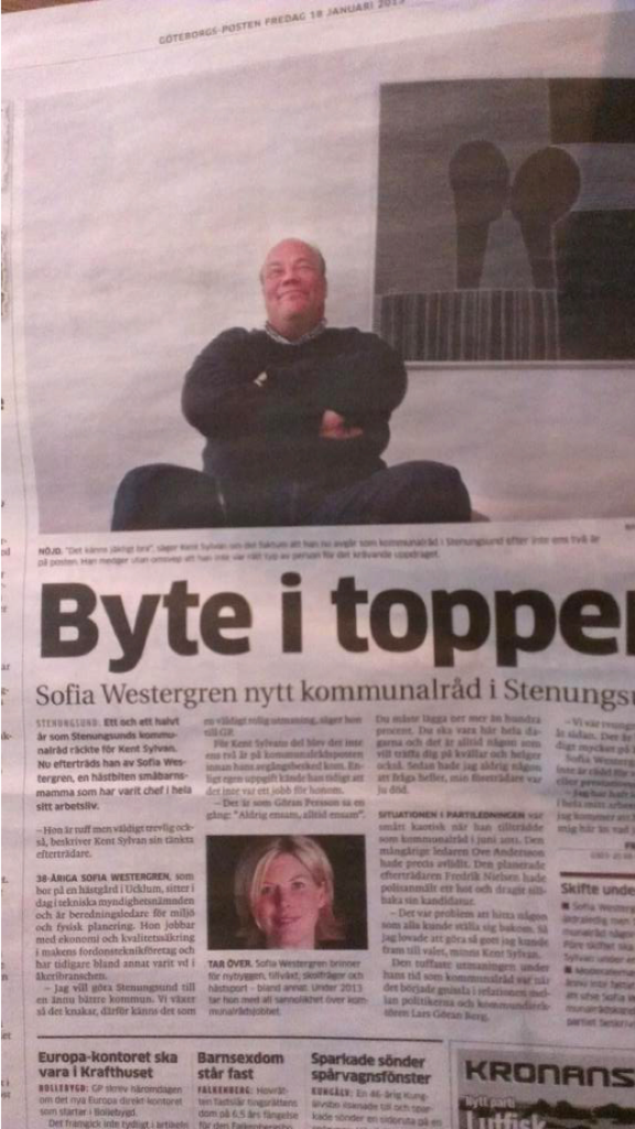
She is the new boss. That’s what the headline, Change in the top, is saying. She’s taking over, he steps down from the post of municipal council chairman in Stenungsund. But not before a photographer could blow him to the bursting limit with the mightiest frogs perspective Stenungsund has seen!
Looks like he’s sitting on her, right?
32
”The woman behind the man”? Must be a misstake. Gina Dirawi is sixteen the times the tv host that Danny Saucedo is. Or well, she is a tv host. (He’s a musician.)
31
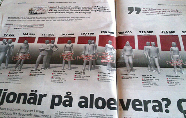
An article about domestic violence? No. Aloe vera selling. For some spooky, inexplicable reason the dishwater grey graphical women have ended up behind broad-shouldered, graphical men in the pair photos (with blood red staples or or pulldown blinds in the background).
30
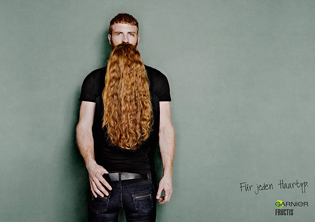
This was what I meant by “in the beards of men”. Do you see her? Clue: check out his front tail. (Spoiler: It’s a back tail.)
Funny or unpleasant photo? A creative invisibility-making, anyhow.
29
Do you see what’s invisible in this picture?
Her t-shirt logo. And every female SATS training instructors. Or is she supposed to symbolize You, the customer? Well, according to the logik in this posts image materials’ logic, I’d rather draw the conclusion that she is SATS’ CEO.
28
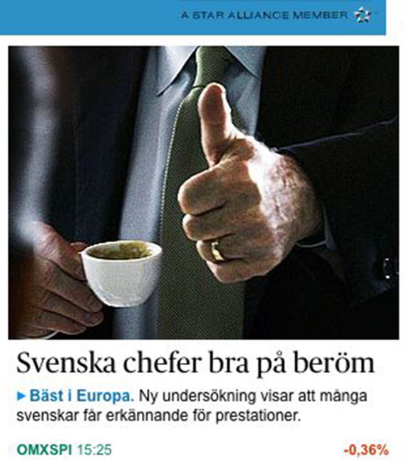
Maybe the most common way of making female bosses invisble. By taking for granted that they are men. (Married, white, middle-aged men, at that.)
27
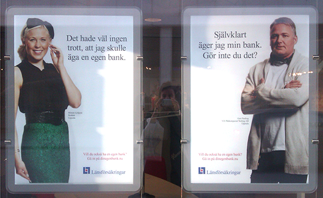
His line: “Of course I own my own bank. Don’t you?”
”I get the impression that she’s slow”, says my intern Caroline.
I get the impression the insurance company Länsförsäkringar are slow. The angle Oh, nobody would’ve guessed I, who am a woman, could do this! feels imported straight from 1950’s advertising. Like her outfit and ribbon on her head, incidentally. Lucky for her there’s a man nearby who without giggling or playing with his sideburns helps clouding her competence further.
26
Länsförsäkringar’s bank owner duo as kids.
25
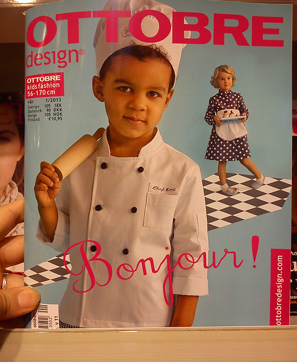
Bonjour, Emil the self-assured master chef. Goodnight, nameless, doll-like 50’s-housewife with dead stare and twisted ankles that’s slanting around on a floating checkered tie (Caroline’s observation) on the cover ot the finish childrens fashion magazine Ottobre.
24
Hey Darth, you dominant little phallos-toddler. Hey girl who’s ended up on the floor between his legs on the pages of playrooms in building product BoList’s catalogue.
23
”Yes. The pink clad hockey kids (without clubs) are girls”, writes the tipper Jessica Westin, who as an old hockey player could not let this epic gender-fail pass when she saw it in Sundsvalls Tidning. And the blue ones, who’ve gotten all the clubs, pucks and attention from the trainer – but no cute princess-three crowns-shirts – are boys.
MAD YET?
In that case we cool down, I think. Why not with some adorable photos of…
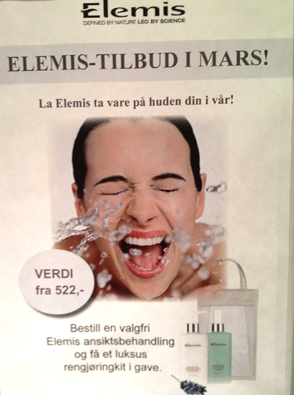
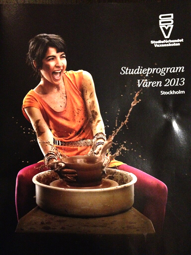
Women transformed into overjoyous, orgasmic beeings by coming in contact with different liquid, clays and trees (a close relative to women that struggles to drink water and women laughing alone with salad).
22
WATEEEEER! My favourite substance in the whole wide world, hihihihi iiiiih!
21
POOOOOOOOOOOOP! Wohoho! Squish squish, blink blink! (”That one you’re going to change”, says my intern Caroline.)
20
“Mmmmmmm. BARK.”
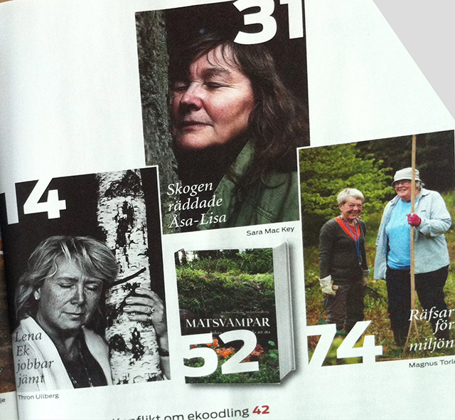
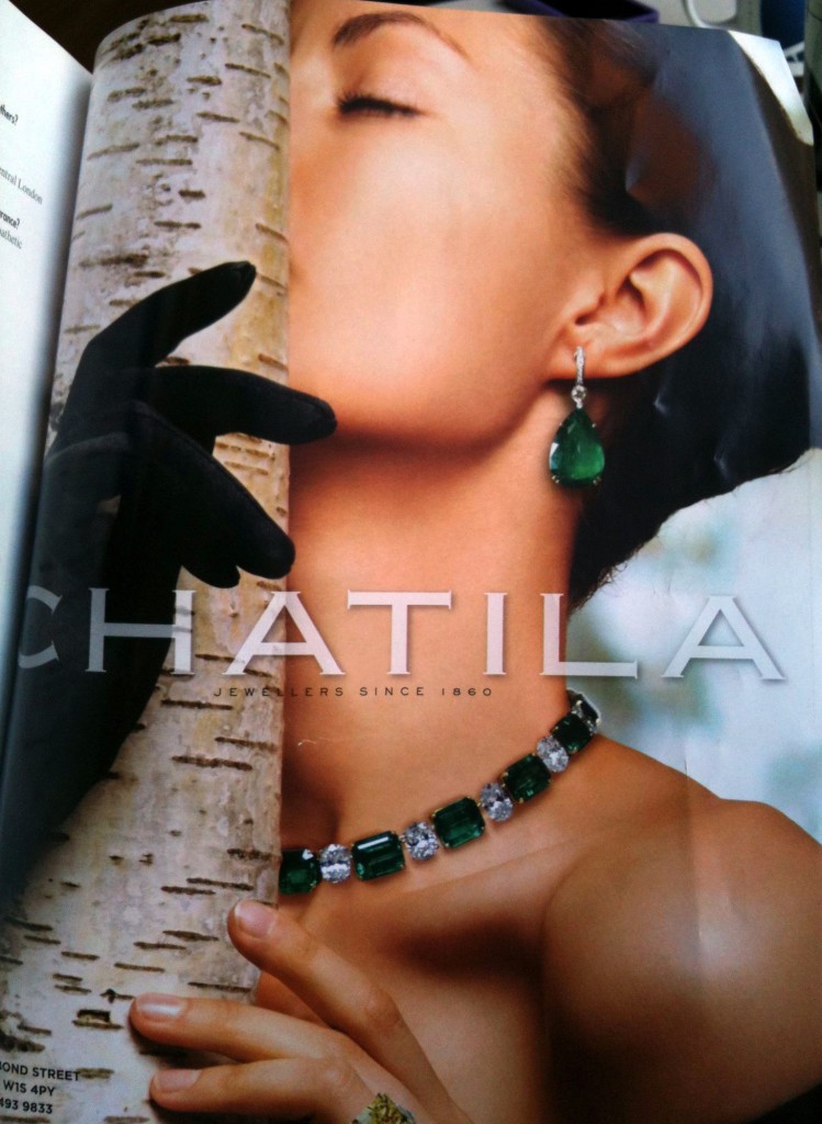
Maybe a justified pose in Naturskyddsföreningen’s periodical Sweden’s Nature. But still an interesting coincidence that two different photographers independently of each other reproduced the meme “middle-aged woman with closed eyes hugs trees”, as the tipper Lisa Hartzell names it.
Even if I have to admit I have seen it before.
19
‘Without title’.
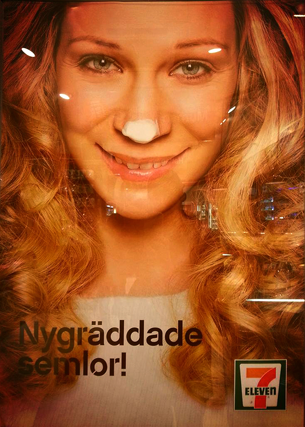
18
He he. You look funny, 7-eleven-being. But an easy prey for the devil.
For yes, where do all these woman-beings originate from? From art, music and literature history, where they’ve acted posts in a patriarchal fatherly gender discourse about women being irrational, innocent children who shouldn’t be let loose in areas that demand reason and self-control, like politics, academia or prestigious offices.
On the other side. What’s really most sound? Images of women who get glad over anything, or…
Men who gets happy by nothing (/a.k.a. murderers)
17
The soccer player Gerard Piqué is expecting a child with the pop star Shakira. And how happy is he over that? So happy he could MURDER. (You? The photographer? The kids’ real father?)
I wrote about this in my post Why so murderous, man?: That the reason men so often meets the viewer with an aggressive, controlling gaze is that ideal masculinity is about being dominant, but also because “the male gaze” is so wide-spread in our image culture that images in media both directed to men and to women turns to a male heterosexual gaze. And with that logic his look could be interpreted as him needing to guard himself to thoughts about homoeroticism. Even when he’s holding his pregnant girlfriend’s belly.
To be reduced to a cute cake-sniffing fairy is perhaps a more mild way of being dehumanized compared to never being allowed to show the faintest emotional utterance, even in images that’s supposed to mediate happiness?
16
The first congratulation card: Myth. Men benefits more of being married and fare worse after divorces, among other reasons because they to a lesser degree are raised to care for relations and therefore let their wife mend the friendship relations during the marriage, something that can make them isolate and become lonely without even a salad to laugh with when they’ve chucked the fetter of marriage.
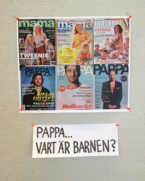
The second card: WHERE THE FUCK IS DADDY?
Teaser for my lecture at Lunnevads folk high school, with an image from my last list of 40 gender-blunders.
15
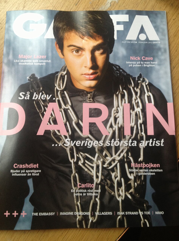
What have you done to popstar Darin, Gaffa? You made him into a Murderer!
14
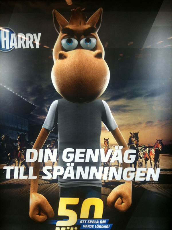
Animals are men. And when animals are men you know they’re ANGRY.
Oops. Now it became heated again.
Incredibly unnecessary and unfitting objectifications of women and sexualisation of services, experiences or educations with the help of women
13
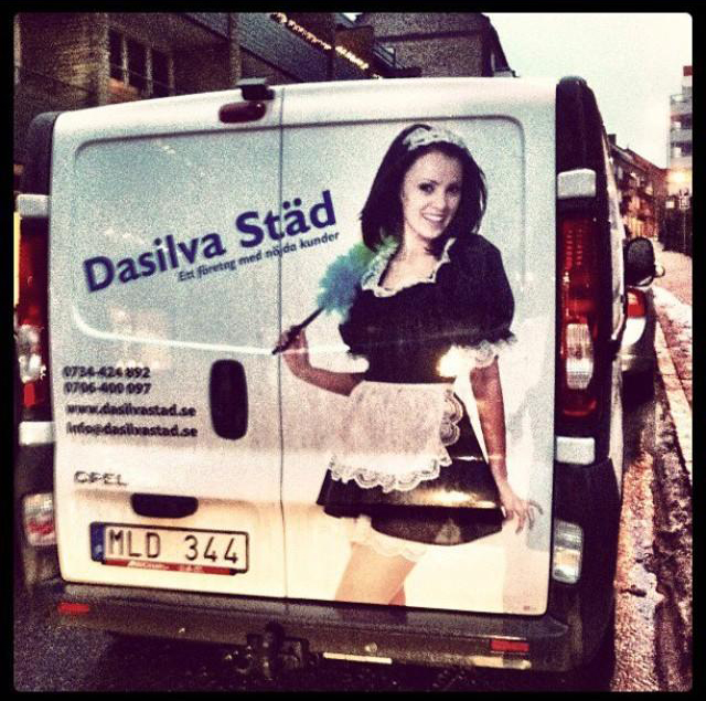
Incredible ill-fitting print on the company car, keeping in mind cleaners are a occupational group that gets suggestions about performing sexual services (mentioned in the last issue of feminist journal Bang).
12
Image removed
Advertising for a cave diving tour. With a girl ready to dive down her own cleft. Had to check if this company has their base in Denmark.
11
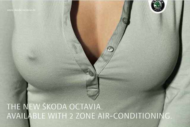
SUPPOSE that this German Octavia-ad is directed towards women or are created with even the least regard for Skodas female clientele. What were they thinking? ”Do You want to look cool in traffic with asymmetrical nipple-erection? By our asymmetrically ice-cold car.”
Nah. Don’t wanna suppose.
10
BREAST-FEEDING BRA. Yeah. For which kind of kid? you might wonder. I suspect we’re dealing with a big, hairy, 45-year old kid with a camera. (Made myself shudder.)
Come and eat, baby.
9
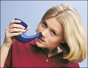
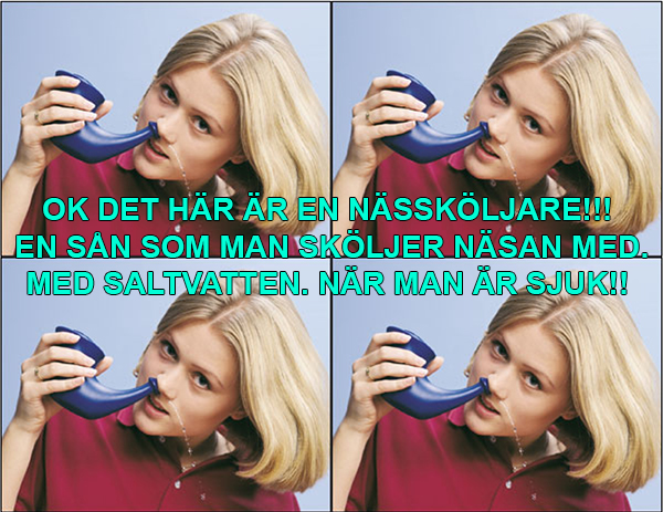
”ok THIS IS A NOSE WASHER!!! One you use to WASH OUT YOUR NOSE WITH. With SALT WATER. WHEN YOU’RE SICK!!!”
Thanks, Maja Olga E. Almgren. Couldn’t have put it better myself. Thought about becoming a copywriter?
(Also read Maja Olga E. Almgrens self-help guide Having a girl-cold. ”Why do you have to be UGLY just because you’re SICK?”)
8
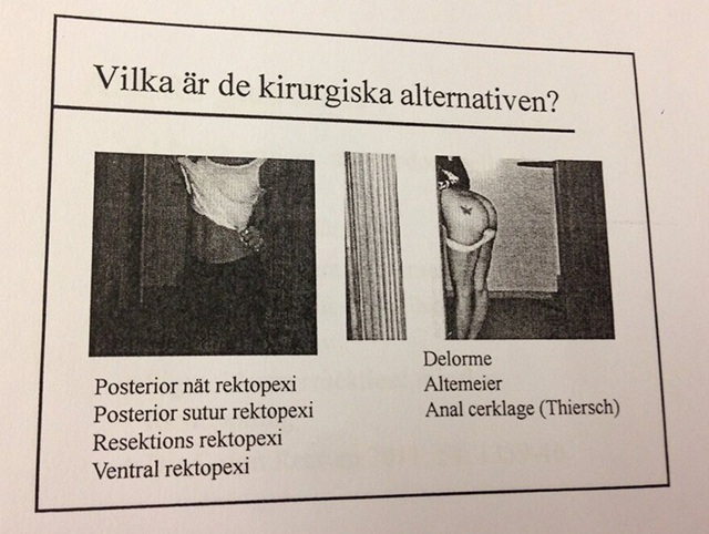
One of the least housebroken places to find the male gaze slip in. During a lecture for doctors in surgery. About rectal prolapse. That is, when the large intestines are about to fall out through the anus. Illustrated with pictures of strippers???, Stfmar, who sent this tip, asked herself.
”What are the surgical options?”
Dirty.
Report the school.
7
And here humanity freezes to ice. And ad for the portable console Playstation Vita. An example of how the female body is emptied of meaning and, without excuses, is made into a toy for men.
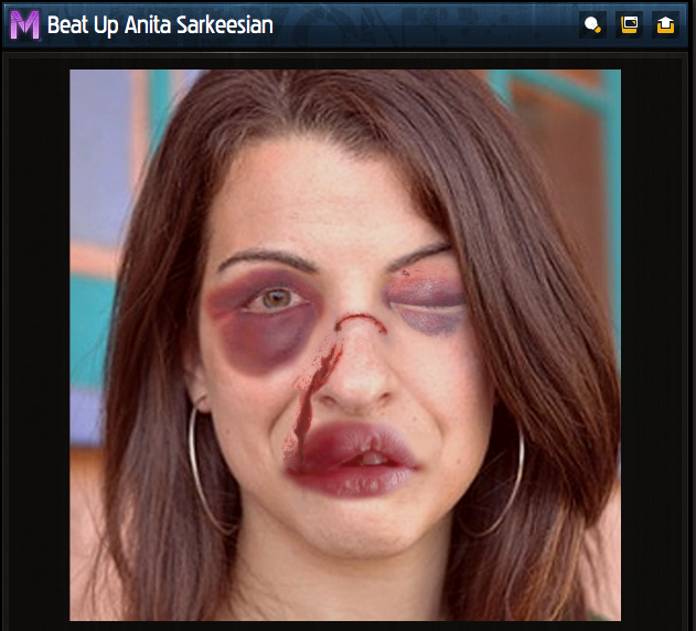
Right now in the video games industrym, though, there’s a first, broad feminist awakening. It started with the brutal backlash against video blogger Anita Sarkeesian, who got the worst Internet hate mob known to humankind after her when she started a Kickstarter-funded project to analyse ow women are portrayed in video games (a review whose first, very well-done part is out now).
Anita Sarkeesian got to hear she’s a jew whore who should be raped, killed and banished to the kitchen to make sandwhiches to the real, male gamers. The mob tried to get all her accounts in the world wide web suspended, spammed, closed. Her home adress was published. One person took the time to materialize all the hate into a video game where you could abuse Anita Sarkeesians face to a hamburger of blood and bruises.
WARNING FOR SENSITIVE IMAGE
*
*
*
*
*
*
This is how extremely stress you can get when someone even fiddles your toys. Safe, simple, one-dimensional woman-toys that in 30 years has been the very symbol of your privilege and confirmation of your unthreatened superiority.
Which leads us into the last category, that I could call flat out misogyny, but that I’d rather give another perspective on by calling…
Masculinity in crisis
6
What do you mean masculinity in crisis? She’s lying there like a wet waffle in bikini in his lap and watching him admiringly. He’s the one that’s dressed and on top and has the situation all under control?
Exactly.
5
The video games world again. Concept art for the game DmC: Devil May Cry. Dressed man. Surrounded by angels in silver hotpants who curiously cling to him. He answers their appreciation with a superior look on his face and by holding his hand like a pistol – at crotch-height – against the forehead of the angel between his legs.
A power-fantasy in its purest image form. From a medium full of power fantasies where white, straight men are the center of the universe and women are chest-heavy character development free crutches to men that constantly has to be rescued or fucked.
There’s a line in this came that could be put as a caption to all these images of a masculinity that begs to be whispered in the ear that it’s enough:
”The world is at last your bitch. As am I.”
4
My interpretation of the image in this Dutch costume ad: A masculinity hanging from a brittle thread.
Or as a student of Södra Latin’s gymnasium i Stockholm put it when I asked them to explain this image: ”That’s patriarchy! Her existens is dependent on him, just like patriarchy wants it.”
3
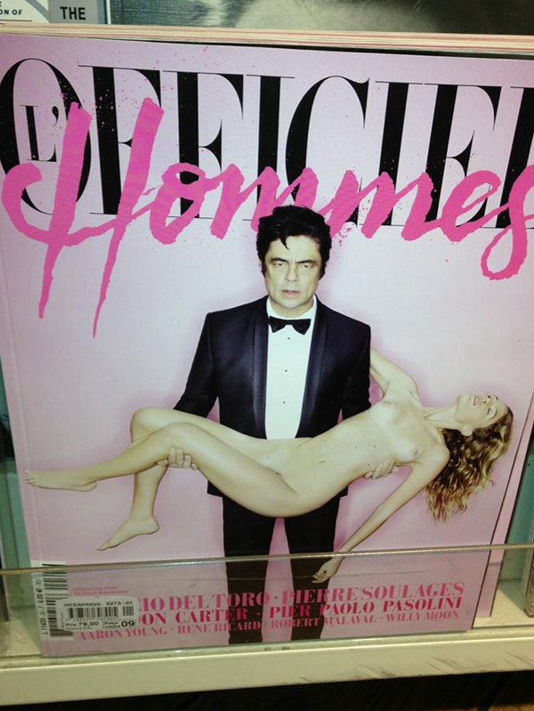
The second grossest magazine cover I’ve seen. And the answer to what happens when a ‘murderer’ is accompanied by a women in the picture.
Or what do you think? Does it look like he has saved her?
I think about a passage I read in Claudia Lindéns text ”Anne Charlotte Leffler and the masculine fantasy’s tragedy” in the new anthology The woman makes the man (2013):
”The man’s superiority and the woman’s aboslute passivity is a condition for hem to be attracted sexually… The woman’s inferiority is in this way not only an effect of, but rather the term for masculinity in the heteronormative game.”
Claudia Lindén
Claudia Lindén writes about Swedish 19th century literature, but I think it feels applicable to the murderer above. Especially the part about “woman’s absolute passivity”. You can’t be more passive, subordinated and powerless than when you’re dead.
And for sure he is horny, alright. He’s doing his best to keep control and his pants on, but his parted lips reveals his inner, tingling, necrofiliac extasy.
This cover, for the french fashion magazine L’Officiel Hommes – literally translated to The offical men – really makes me wonder how inflamed the gender debate in France is, when their men has to se this, eh… comforting images.
And especially since this magazine cover came out of France just in September last year:
2
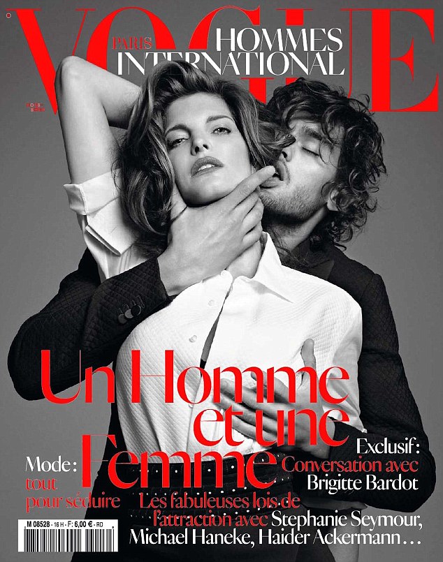
The most disgusting magazine cover I’ve seen. Also of a magazine directed towards men. The legendary fashion magazine Vouges international men’s edition Vogue Hommes International.
And the headline they chose? Even it is phrased as a post in the debate about the gender order. Un Homme et une Femme. ”A man and a woman.”
I feel powerless when I see this image. For the criticism of images like these will always be explained away with it being about passion, not violence. But as the New York-office of NOW (National Organization for Women) wrote in a letter to the publishing house that makes Vouge: According to a 2008 study of murders of women in 11 US cities, it was found that 43% of women killed by their partners had experienced at least one incident of strangulation before being murdered.
Who thinks it’s a good idea to even play with the lethal fire of suggesting that all women deep inside are masochists who get turned on by violence?
I can tell you who took the photo. Terry Richardson. The photographer who breaks all records in degrading photos of women, who documents himself fucking models, is accused of sexual harassment (like Dov Charney, founder and CEO of American Apparel, the company who breaks all records in degrading photos of women and child-porn influenced fashion photography) – and is celebrated as a male genius. So you can count on it being a testing of limits.
I think the most unsettling thing is her eyes. I think it looks like she’s starting to run out of oxygen and hardly can keep her eyes open. And the gloss in them looks unusually badly photoshopped. (On purpose?)
My intern Caroline did this brilliant observation: It’s her elbow that hinders her from looking completely passive. It still gives her some kind of mobility. If she would’ve taken it down she would look paralyzed, and then it would be hard not seeing the image as something other than… the patriarchy’s violent hostage-taking of the image of the woman.
The man: Out of it, lost in his own sadist, horny-misty world. Far removed from his crisis.
1
This trend.
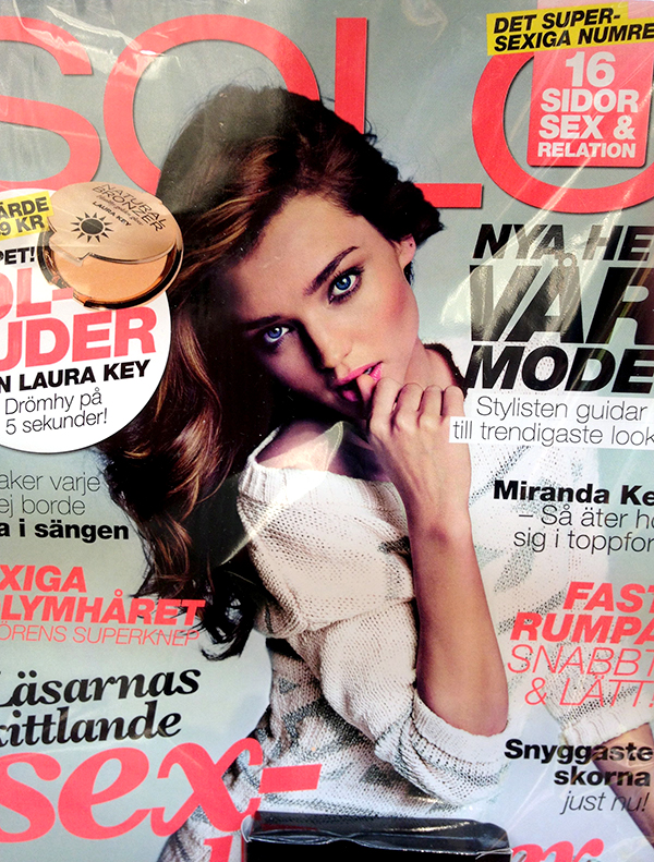
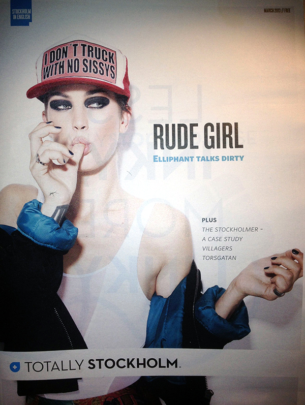
OK. Home assignment: What exactly is sexy about women acting like toddlers?
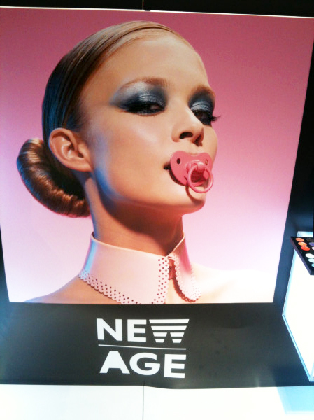
Gina Tricot, SOLO, Totally Stockholm and Sephora aren’t clothing brands or magazines that exclusively cater to antifeminists. So it’s harder to speculate about men dreaming about women as manageable and powerless as babies, or about a male fear of mature women that has experience and knowledge, or an equality movement that moves in babysteps. The space for taking infantilizing photos of women sucking their thumbs or pacifiers is within forums for regulating and re-creating of desireable femininity.
Can you imagine a man with a pacifier in his mouth on the cover of King Magazine, Café or in an ad from Jack & Jones? WITHOUT holding a dead woman and thus having the excuse that he’s just a chill serial killer.
DISCUSS.
And carry on sending me tips, all you sharp-eyed out there. Soon we’ll take this to the next level.
Thanks for contributing to this post with tips Emerentia L Lund, Fredrik Rosenqvist, Pernilla Alexandersson, Sara Gabrielsson, Daniel Eriksson, Lunchgren, Axel Pettersson, Isabelle Lundqvist, Erika Wallman, Lisa Enquist, Isabelle Lundqvist, Albert Säfström, Elise Nilsson, Christina Norling, Sophie Winberg Tyrfelt, Anna Borg, Annika Jönsson, SvintoBoll, Lisa Hartzell, Johan Forsberg, Sofia Zequana, ⓋAD, Lisa Sandblom, Martin Jansson, Anna-Karin Larsson, Per Eeg Olofsson, Ida Wallinder, Annika B Kupiainen, Susanne Jörtsö, Jusey, M, Kerstin Alex, Susanne Jörtsö, Terese Persson, Elham Kalhori, Jannilla Lidén, and Ingela Wahlgren.
Happy bodies help against nude shocks
Hi gender fans! Last Friday I was finally in Swedish Radio’s show Sleeping with P3, after talking about it with host Matilda Berggren all summer. Our conversation was about why women are not allowed to be naked and funny.
Matilda sent me a picture that she had as a profile picture on Facebook when it was new. It depicts her naked, carelessly holding a cigarette with raised eyebrows and with three selected bodyparts covered in happy hand-painted smileys. A picture that she thought perfectly captured a nice evening when she was a little tipsy and newly moved in with a friend, enjoying life. Most of her friends laughed and thought she was lovely. But not everyone understood the joke. A colleague at her new job asked if she was looking for a fuck-contact and strangers emailed her lewd suggestions. As a statement – ”no, I do not do this because I am horny and want to fuck or show off my sexy body, it’s just a fun picture” – she kept it as profile picture. But after a while she made more friends that she did not know if they would see the irony and could no longer defend it.
”Something tells me that a guy with a beach ball in front of his dick would not have been as stinging or provocative in the eyes of others.”
Matilda Berggren’s initial idea was that I would photograph her when she was naked, funny and a woman at the same time. But her managers at Swedish Radio shot down that idea, saying it could be interpreted as a pin-up photo and therefore was inappropriate.
Which in confirmed our whole thesis…
Women can be vulnerable, vulnerable, passive (dead is perfectly okay) and abbove all sexy when they’re naked in photos. For men, it’s different. They can cook only dressed in aprons or stand with their pants down in front of stunning views on Facebook photos, and there are plenty of examples of hairy, plump, hilarious, unsexy nude men in Hollywood comedies (think of wrestling scenes in Borat, or the intros to the Austin Powers movies). But when a woman is naked and funny, when she uses her body to amuse herself, entertain others or enjoy her own body, then we’re suddenly… Scared?
Let’s try it. I have two contrasting examples. One that shows how we usually get to see naked women in public. And one that shows what kind of nude photo gets your Facebook account deleted. (Get a pillow to hide behind! Iiiih!)
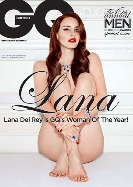
This is Lana Del Rey on the cover of the latest issue of men’s magazine GQ:
Vulnerable. Covering up. Exposed. As if frightened by the lighting, sitting against a wall, looking under her fringe, well-made up and adorned. And despite her shy, anxious face, she is still so excited that she cannot breathe with her mouth closed. Just like a gentleman wants her.
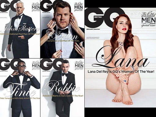
Lana Del Rey has been named Woman of the Year 2012 by the magazine. And from a lot of places I have received the tip on how GQ has chosen to portray its winners in the various Man of the Year categories:
Very telling. Four strong straight-backed or rigidly staring, controlled kings who do not have to be bodies. As it usually looks – not just in men’s magazines – but in everything from perfume commercials to entertainment guides.
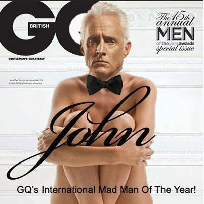
What would it look like if they were shot naked and vulnerable on a floor, holding their limbs neatly in place? We can thank the resource site A girls guide to taking over the world for illustrating that thought:
Oh, boobie! Doesn’t your scrotum get frozen? Wanna do the helicopter to get warm or put on a sock? (Sorry, I’m probably engaging in double standards now.)
But back to my promised nude shock.
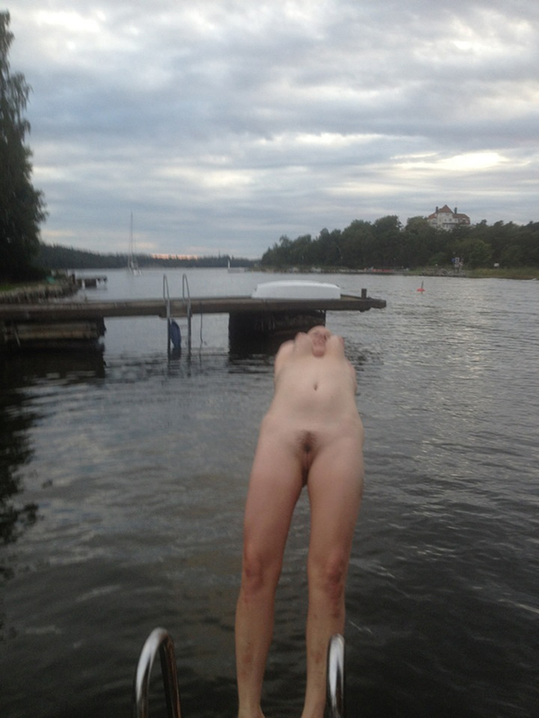
This picture was posted by food blogger Berit Runge on her Facebook the day after attending a party with barbecue, sauna and swimming:
BUT FOR FUCK’S SAKE! responded Facebook, blocking her account and making her to promise to never post anything offensive again if she wanted her account back. Berit Runge removed the image from Facebook, but posted it on her blog instead, in the middle of recipes for pies and soups.
In the post she explains, very similar to how Matilda Berggren explained her old profile picture, that it was taken when she was overjoyed, slightly after-party drunk and wanted to swim. That the photo conveyed all the tingling, end-of-summer joy she felt and that she also thinks that the image is the first that is really her: ”Boundless, happy, totally the-devil-may-care.”
”For real. Are you offended? Then I suggest you work on it. You see two breasts swaying by the centrifugal force and some pubic hair. I actually get a little worried about a society where a completely normal summer nudity is taboo to the mild degree that a picture like this worries anyone. This is neither more nor less than most of my friends have ever seen of my body in some opportunity. It’s not that fucking secret. It looks like people do the most. But in this case: A little happier. Let us affirm happy bodies, instead of taking offense at them. I think it will make us all feel better. ”
Berit Runge is so sensible that I just have to quote how she responds to a comment as well:
”I think it’s very scary that we are heading towards a society where we are moving towards a greater sexualization of the body. Because that’s what it’s about. The fewer normal happy bodies we get to see, the more mysterious the body becomes. And more and more people are starting to think that there is something wrong with them because they do not have porn-movie bodies, because they are the only bodies that can be viewed. I love my body, especially when it manages to rock me in such an amazing arc. I don’t pose sweetly. I show how to use a body to have fun with it. ”
Happy bodies. The finest thing I’ve heard. And ”sexualization of the body”. By that, Berit Runge does not mean (at least I do not interpret her that way), that all sexualization of bodies is evil. As blogger and psychologist Tanja Suhinina writes in a post about Berit’s image:
”Defending the image with ’it was a happy natural image, not sexual’ means that you show that you think happy natural bodies should not be considered offensive – but it would be a different matter if the body was sexual. And then of course you legitimize that sexuality in images is offensive.”
There’s nudity. There’s being sexual. And then there’s sexual objectification. The kind that meets us constantly in fashion, media, ads and product packaging and which – when it comes to nameless or faceless models – says that (mainly) the female body is an object, a commercial commodity that must be judged, valued, disciplined and refined (according to stiflingly tight body standards and with digitally doped bodies as ideal), owned and consumed. And as when it comes to women who are actually interviewed as persons, it lets us know that the most valuable characteristic of a woman is to be covetous in the eyes of others [men].
In other words. The sexual objectification that makes up 95% of all the tips I get on Twitter, email, Facebook and directly from people’s mouths every week. The one who usually just feels very unnecessary.
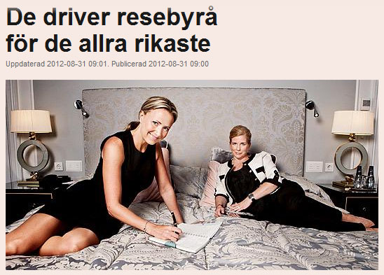
Like when the founders of a travel agency are filmed for an interview in the magazine Dagens Industri lying in a hotel bed (photo by Evelina Carborn):
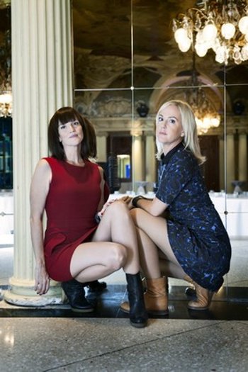
Or when a couple of detective sisters are photographed sitting on the marble in short skirts with cross-legged leg-showing poses:
Or when two American talk show hosts are photographed for Vanity Fair and the female of them goes up into I don’t know what flirting with her male colleague.
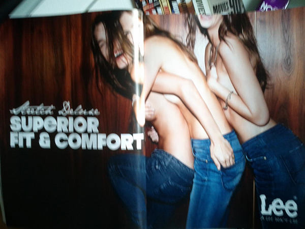
Or when the female models hang on or pull out a breast behind the male model in a jeans commercial: 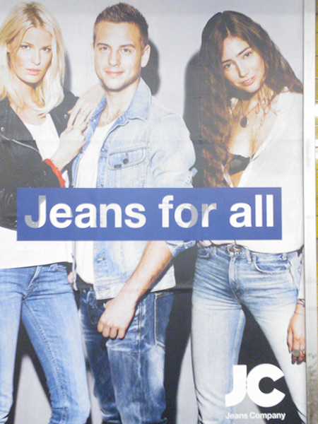 Or when a bare-chested group of girls laughs, fools around and helps each other to cover up when the photographer is on the prowl, in another jeans commercial:
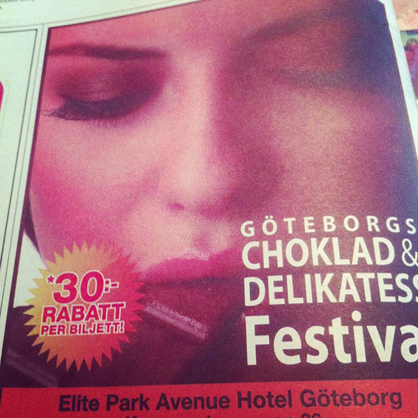
Or when the Gothenburg Chocolate & Delicassy Festival markets itself in a newspaper ad with a still image from a chocolate porn movie (???):
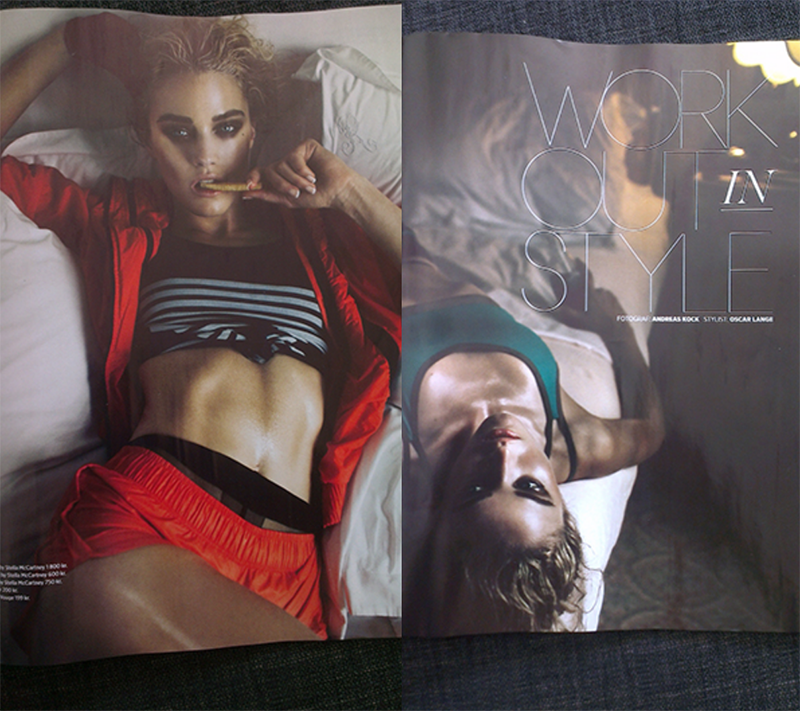
Or when NK:s magazine STIL shows training clothes with models chilling in beds:
What is really most offensive? Berit Runge’s favorite image of herself or the endless thread of women as passive sex objects in fashion, advertising and bad gender photography?
Which image is really most offensive of these two …
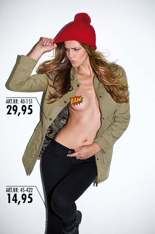
The clothing store New Yorker’s ad for an autumn jacket and a pair of jeans (aimed at female buyers, we must assume?) With a model who gets one of her nipples batman censored and unbuttons her fly:
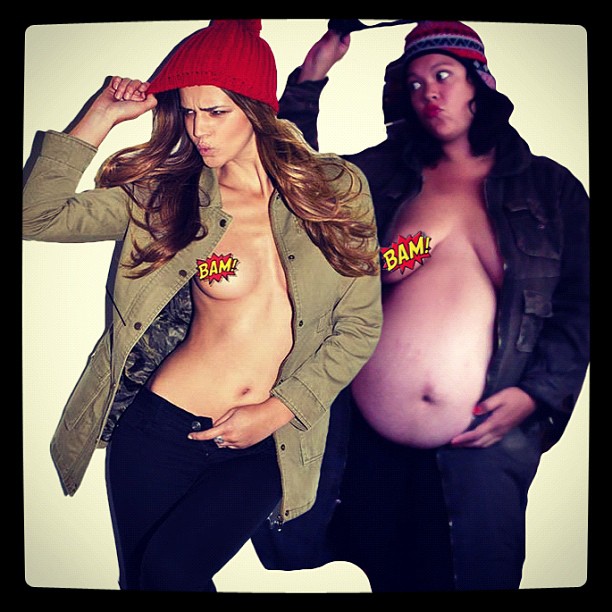
Sell stuff with me & girl. Whose jacket do you get the most craving for now? If the underlying message is something like: ”If you buy this jacket, your stomach will be flat and your breasts firm”.
I have a hard time getting over how cool and funny this counter-attack is. And it doesn’t get worse by the fact that Anna Davidsson runs Mammaformer.se, a site where women can send in pictures and texts about how their bodies have changed or not changed after a pregnancy.
But just as in the case of Berit Runge and Matilda Berggren’s pictures, not everyone understands the liberating joke.
Leslie: You’re supposed to be a teacher and flash your breats like that? Professional! I wonder what your students say about this picture (or does with it)? And their parents? You could have gotten your point across without showing half your body.
Här vill jag låna ytterligare ett välformulerat rytande från Tanja Suhinina, från hennes inlägg Min kropp. MIN. angående att hon gärna skulle lägga ut nakenbilder på sig själv men känner sig hindrad av sitt jobb och framtida jobb:
Here I want to borrow another well-formulated roar from Tanja Suhinina, from her post My body. MINE. regarding that she would like to post nude photos of herself but feels hindered by her job and future job:
”… I hate it. I hate that others get to decide what is more or less appropriate for me to do with my body. I hate that others decide how appropriate it is that my body is exposed. I hate at all when others say for me what to do, and when they should decide over my body – and that it’s so fucking obvious in our society – makes me boil inside with anger. Why is it considered so obvious that you have to stop respecting a person if you seen his nipples in the photo? ”
This is what Tanja Suhinina writes in connection with this article in The Guardian, about how paparazzi photographers, uploaders of creepshots (pictures of women’s body parts sneaked in public) and revenge porn (sex pictures uploaded without consent and which are said to be from ex-partners) create a forum for hunting, cheering and exchanging ”fallen” women in the picture and what real shame spots a virally spread sex picture can actually put an end to a young woman’s life.
Horrific reading. But at the end of the article, there is a quote from law professor Mary Anne Franks that I find very enlightening:
”I think there is a rage against women who are sexual on their own terms. We are completely calm with women who are sexual, as long as they are objects and passive, and we can turn them on, turn them off, download them, delete them, whatever it is. But as soon as there are women who want some kind of exclusive right regarding their intimacy, we hate it. We say, ’No, we’ll make you a whore.’ ”
I know. A woman who is naked and funny is perhaps uncomfortable, even scary, because it automatically makes her a subject? (Try to imagine a picture of someone who is passive in a humorous way. Joking is a way to be active.) In our collective reptile brain, maybe we are simply not ready for women who do what they want with their bodies?
Berit Runge mentioned in a comment that she removed a ”totally off topic comment that completely missed the mark and was also Islamophobic”. I can easily imagine that it was some kind of stone-throwing in glass houses regarding honor cultures, from a like-minded person to the person who posted this picture on a racist Facebook forum:
Click on the image to enlarge. To stop laughing, I do not know what to do.
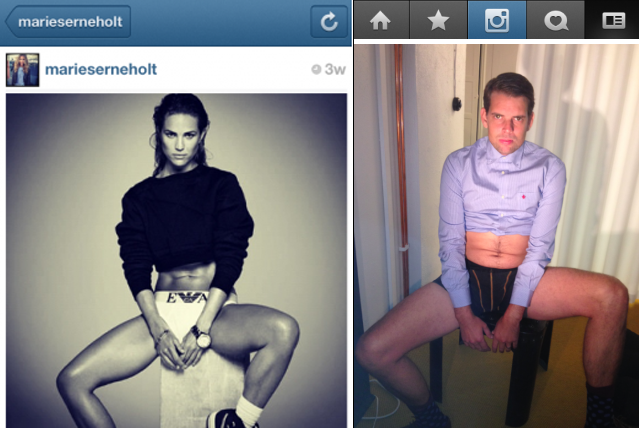
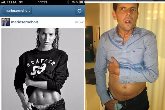
But now I actually have to comment on last week’s most commented pin-up photo. Alex Schulmans. On Wednesday, he published a parody of photos Marie Serneholt posted on her Instagram from a photo shoot for the magazine Café.
Since Alex Schulman is a man, shows skin and is funny, you can of course guess that people laughed and cheered. But not Kakan Hermansson. She accused Alex Schulman of misogyny and congratulated him on succeeding in sexualizing, declaring stupidity and double-punishing Marie Serneholt, while at the same time helping to further de-sexualise the male body.
Also, Alex didn’t aim his criticism towards the entertainment industry’s extreme fixation on appearance or what women must do to be seen in it – but against her. But what also escaped him isthat Marie Serneholt’s pictures are also a parody:
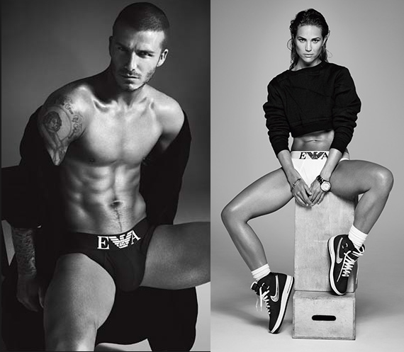
Det är i alla fall jättelustigt att den här debatten uppstod kring bilder där hon är fotad exakt som om hon vore en manlig kalsongmodell. Med hårt utmejslade magrutor i svartvitt ljus och hårda skuggor, jättebredbent och självsäker, utrustad med en fet klocka. Hon har till och med kalsonger på sig. (Kolla märket på dem. Samma som kåt-Beckhams. Jag sparade bara ner första bästa kalsongmodellsbild. Kan bilden på David Beckham ha funnits med på en datorskärm under plåtningen, till och med? Visste Alex Schulman om att han parodierade David Beckham?)
In any case, it’s very funny that this debate arose around pictures where she is photographed exactly as if she were a male underwear model. With hard chiseled abs in black and white light and hard shadows, wide-legged and confident, equipped with a fat watch. She even wears briefs. (The same brand as Beckham’s, even!) Did Alex Schulman know he was parodying David Beckham?
This could be one interpretation of what the philosopher Judith Butler meant with: “…gender is a kind of imitation for which there is no original”.
Anyway. Alex Schulman has also been has also been filmed for the magazine Café once upon a time (2008). And then it looked like this with the gender-awareness:
Which images are really most needed to parody?
Finally, I want to touch on a topic that some men, a little worried, have asked me about. Do I think men should be sexualized more?
Objectified? No. Not really. Everyone deserves to be a subject. It disturbs one’s flow to constantly walk around and think about how one is perceived and judged by others (self-objectification). Studies have shown that objectification affects men and women differently. It also looks different. Once men become objectified, they are still made large, strong, independent and active, which are handy qualities if you are to be a subject. But the message in those pictures is that a man must be big, strong, independent and active (to be able to perform). Which of course puts a lot of pressure on men and is just more fuel on the macho fire.
Sexualized?
Why, yes.
I always find it a little sad when men wave away their bodies as comical, ugly and innately unsexy. What does it really do for men’s body image? ”The woman in her true image is sexier than the man. Sexy and powerful enough to create life”, thundered a now grown childhood friend on my Facebook wall. To that I replied: ”Many people experience the male body as at least as sexy, but it is not sexualized in the same way in fashion, media and advertising.”
All images of independent, controlled and closed off men who refuse to pretend to show off themselves (even though you automatically always do so and in that sense are passive when you stand in front of a camera). That looks like they’re not making a single noise in bed …
What do they really do for men’s sex lives?
Perhaps it would be liberating, in the case of men, to see more images of men who are sexualized, and perhaps a little objectified as well; men who are soft, beautiful and inviting and who actually dare to be intimate and give in to him; which may be vulnerable, responsive objects instead of acting, performing and reserved subjects, for once.
Conclusion
We want equality, right? Either we all sexualize everyone or we sexualize no one. It can actually be that simple.
Jonathan Rieder Lundkvist, a skull-voting (Pirate Party voting) photographer, has learned that.
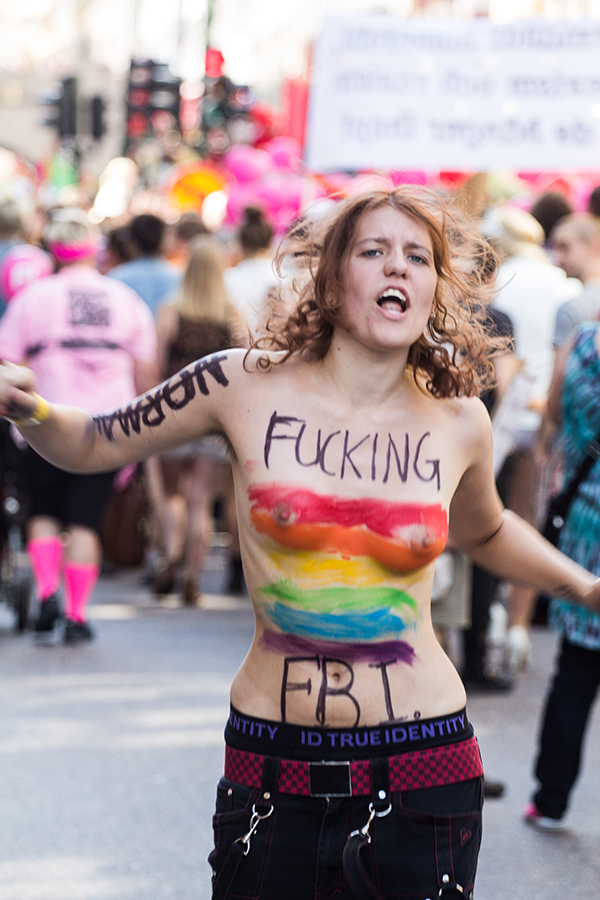
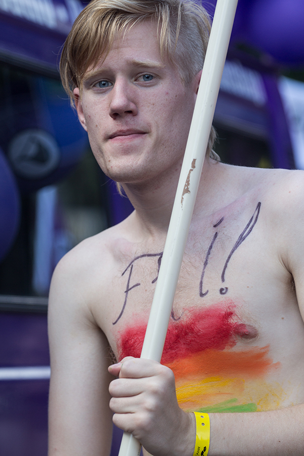
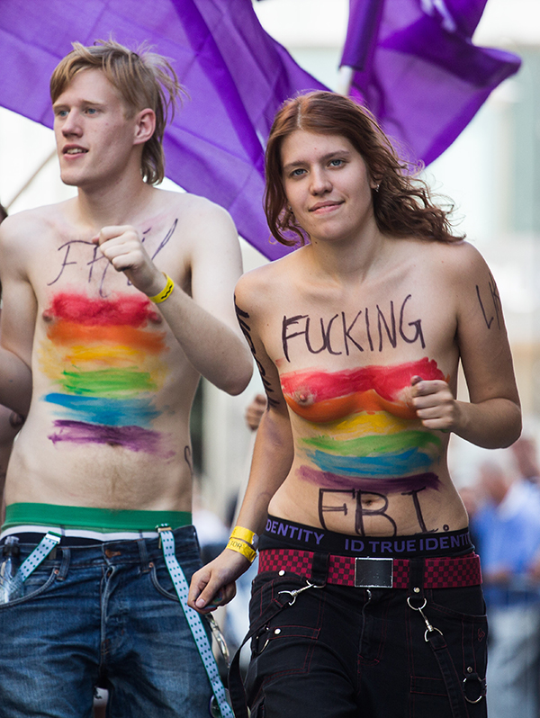
After photographing the Pirate Party’s segment of this year’s Pride Parade, he asked his friend Inga, who marched topless, if it was okay for him to publish the pictures of her on his blog. He had already published pictures of male party comrades with only breasts, but held back the pictures of her until he knew he had her consent.
She replied with a scolding.
She thought that either I should ask everyone or not at all ^^
When Jonathan Rieder Lundkvist asked me how I thought he should approach asking women in parades about permission in the future, I said:
Smart idea to start asking men.
So when I asked Jonathan Rieder Lundkvist if I could use his pictures from the Pride Parade, he asked both Inga:
Inga answered that it was okay and asked Jonathan to tell the Gender photographer that he’s awesome. (^^)
Max said:
”Yo, bro. It’s cool with me.”
:)
I think we can end with that. Two happy, expressive, free bodies.

